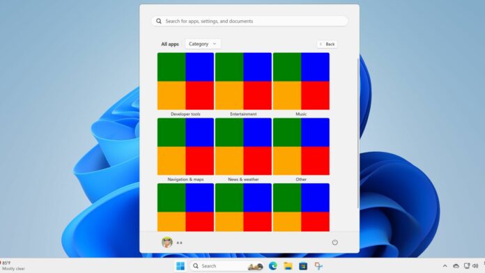
Windows 11’s Start menu is usable, but the All Apps section is a pain to navigate. The list view forces you to scroll down till you find the desired app. However, this could change because Microsoft is testing a “category” view in the All apps section.
Windows researcher PhantomOcean3 noticed a new hidden feature in the latest Beta build, 22635.3930. Windows Latest enabled this experimental feature to test it out. Unlike other hidden features, this one’s half-baked and shows solid colors inside each category tile.
Nevertheless, we got a rough idea of what Microsoft is aiming for. The feature will automatically club the apps related to a category inside a tile. It could also add a dedicated icon for each category, which would be helpful.
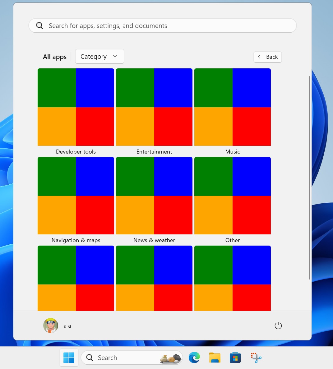
Or it could display the four most-used apps of that category on the tile. We think that because the tiles show four solid colors instead of one. The possibilities are endless, yet a dedicated icon for each category makes more sense.
You can pick the Category view option from the drop-down list at the top of the All apps section. Earlier, Microsoft tested a “Grid” option in the All apps section, and now the Category option also surfaced in the Insider builds.
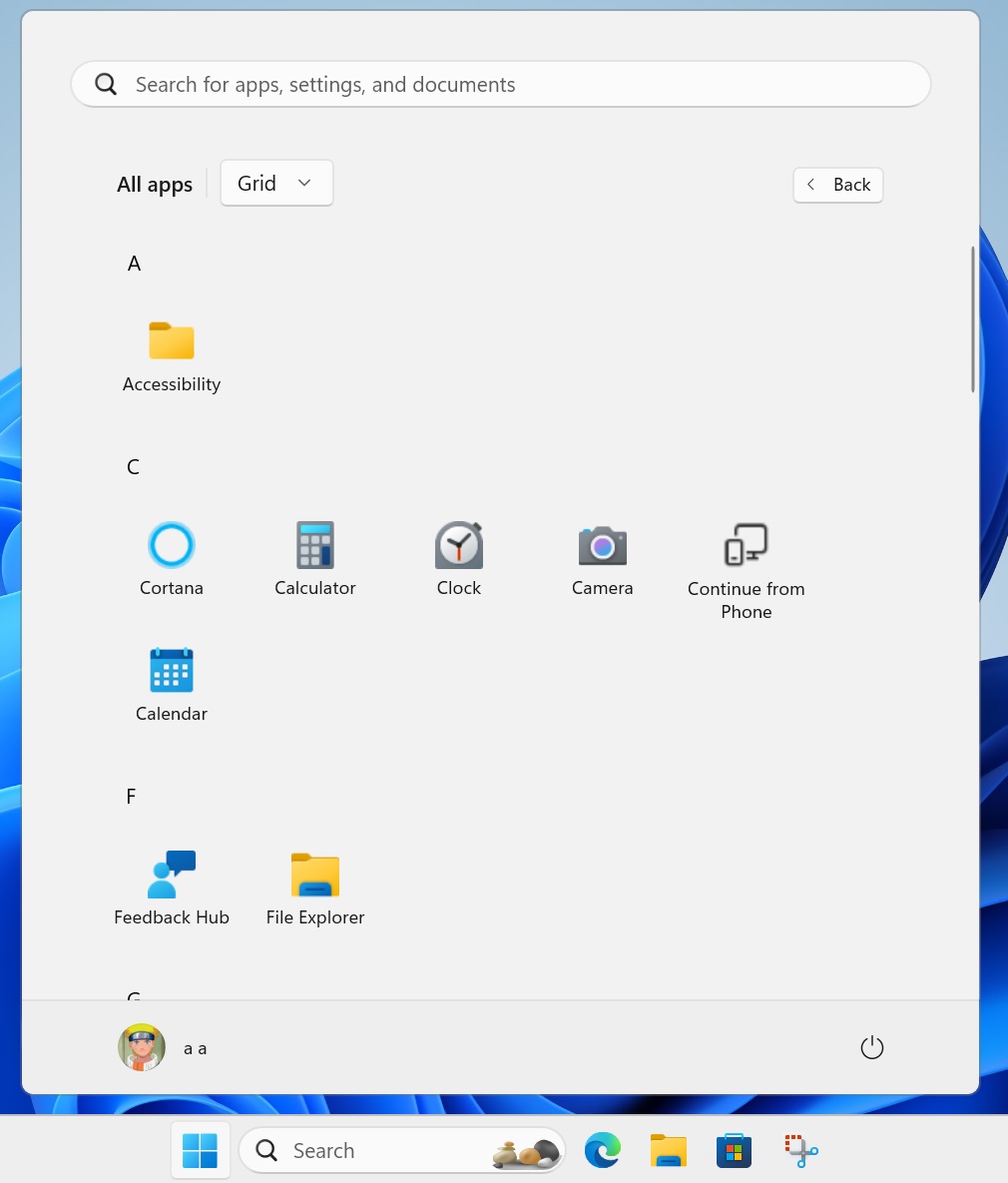

Regardless, both options will help you find the apps faster.
Start Menu will get multiple improvements
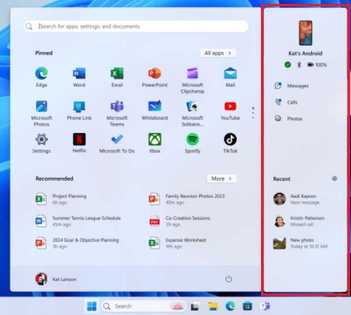
Windows Latest observed that the Start Menu is among the key focus areas in Windows 11 24H2. Earlier, we spotted a companion panel for the Phone Link app, which allowed you to check all the recent activities and stats.

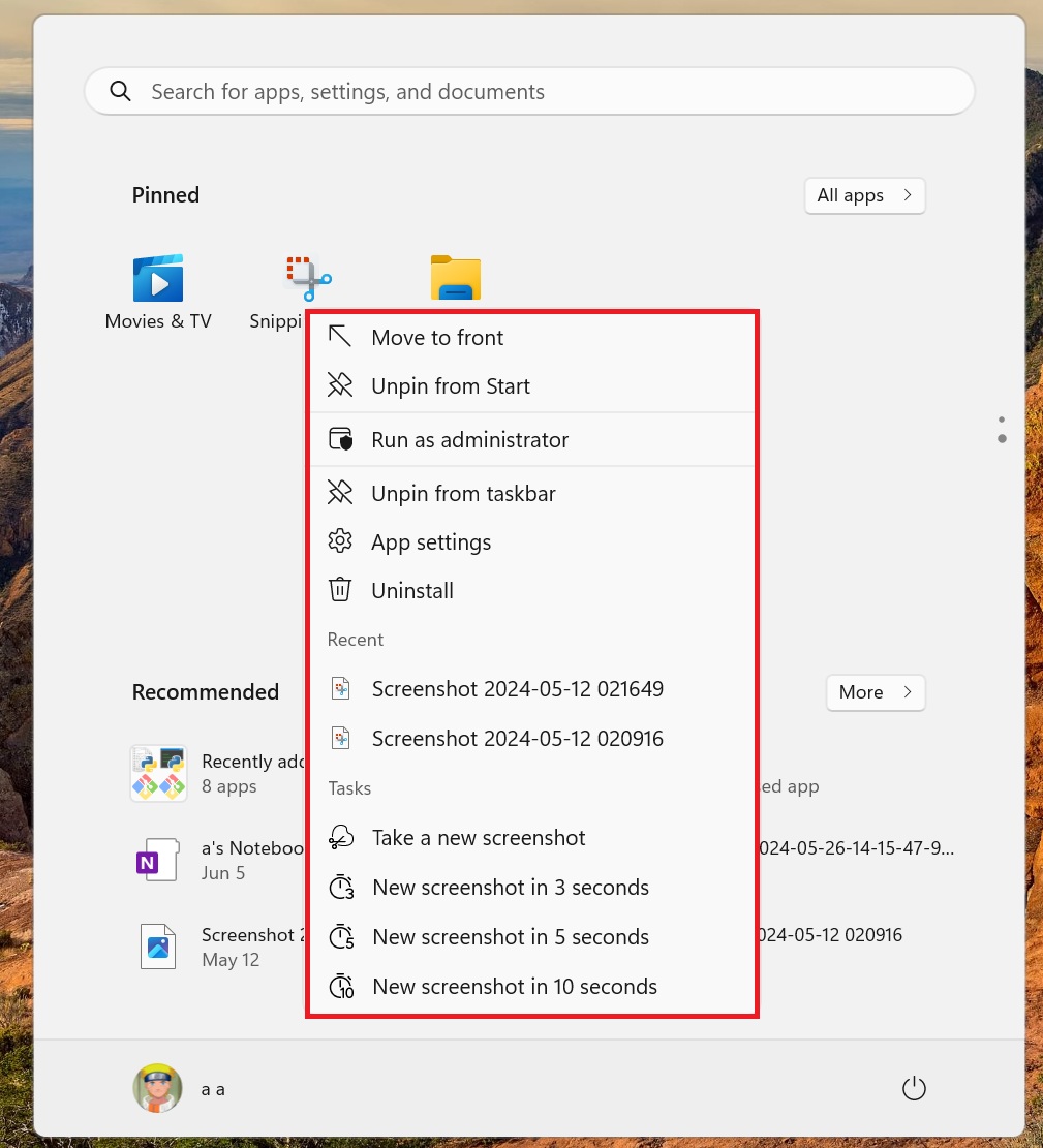
Another hidden feature that we covered was improved jumplists in the Start Menu. When you right-click on a system app, you will see more useful options in the context menu.
For example, if you right-click on the Snipping Tool icon in the Start menu, options related to capture and timer will appear.

Microsoft has already released the Account Manager for Windows 11 23H2 PCs. The feature lets you check some Microsoft account details without opening the Settings app page.
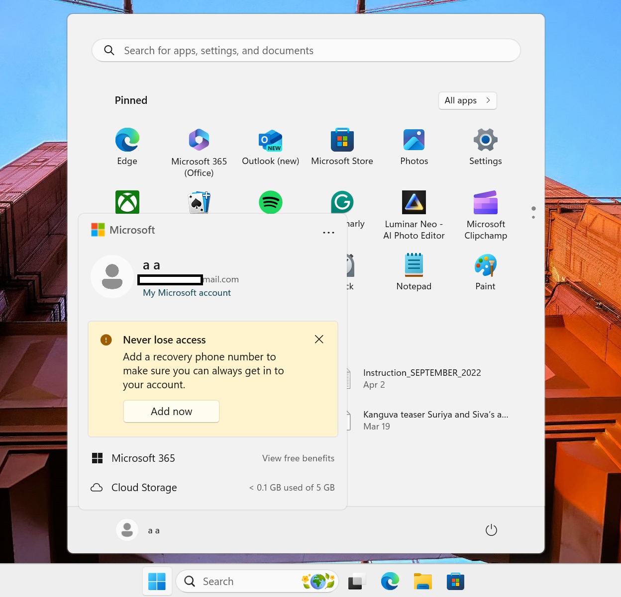

However, users weren’t happy with the change because it bundles some product ads with the account details.
