The Google Keep app is a versatile under-appreciated app that can help you create a shopping list with boxes that can be “checked off” when you add each item to your shopping cart. You can build ordinary lists, use labels to stay organized, and make hands-free notes when inspiration hits instead of waiting to find a piece of paper and a pen. You can also create sketches and illustrations with a whole palette of colors and different virtual writing instruments to choose from.
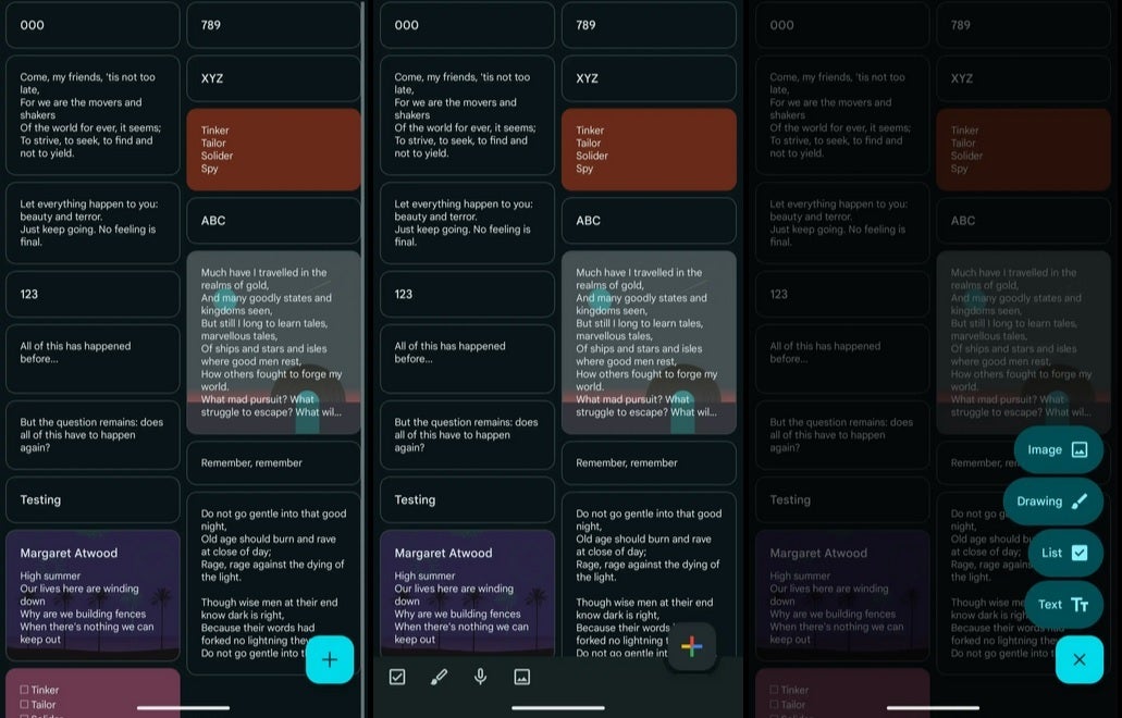
Tapping the new button will allow Google Keep users to create a new Image, Drawing, List, or Text note. Each of these options are housed in a pill-shaped field using the Dynamic Color theming. This replaces the bar in the bottom left of the display which displayed icons to press to create a new Image, Drawing, List, or Text note. Removing the bar will allow users to see a little more content on the display.
If there is a downside to the new design, it is that notes and lists can no longer be made on the Google Keep app with a single tap without a workaround. Now, Android users will have to tap the FAB first before selecting what type of list or note they want to create. As noted, there is a workaround for this and that is the Google Keep widget for Android which will let you choose between creating an Image, Drawing, List, or Text note with just one tap of the widget.

[img center inline [[422414]]:”To keep creating a list or note with a single tap, you can install a Google Keep widget. | Image credit-PhoneArena”]
The new look is coming as a server-side update to version 5.24.432.x of Google Keep for Android. So far, there is no sign that the iOS version of the app is about to get this redesign.
