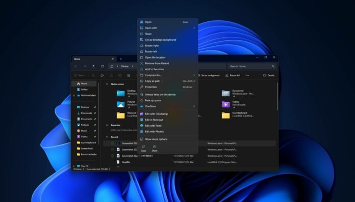
A new Windows 11 update makes the modern context menu more cluttered, similar to the Windows 10 version. It adds options like ‘Edit with Paint’ outside the ‘Open with’ menu, which makes us wonder: what was the point of the modern context menu if it was just going to get bloated?
In addition to the Start menu and taskbar, one of the reasons people hated Windows 11 when it came out was the context menu. With Windows 11, Microsoft replaced the classic context menu with a modern version that takes up more space, follows Fluent Design, and was supposed to be more compact.

After Windows 11 Build 27744, Windows Latest and other people noticed that there’s a new entry for “Edit with Paint” in the context menu.
Since the modern context menu is already huge in terms of size, changes like this are easily noticeable because they add more space to it.
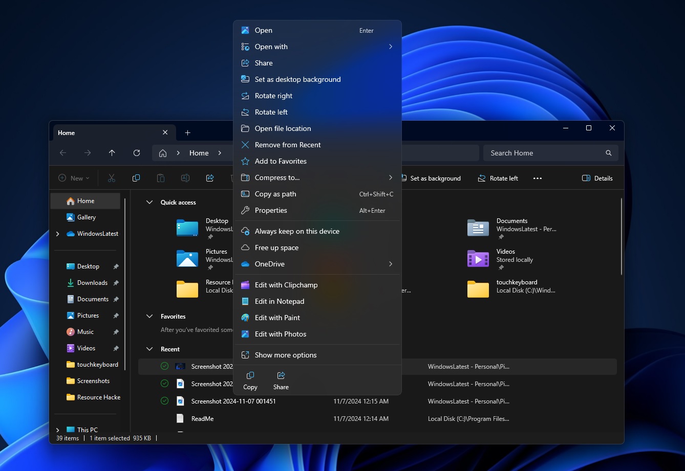

And if you click “Show more options”, you’ll also spot the same options because they share the common source:
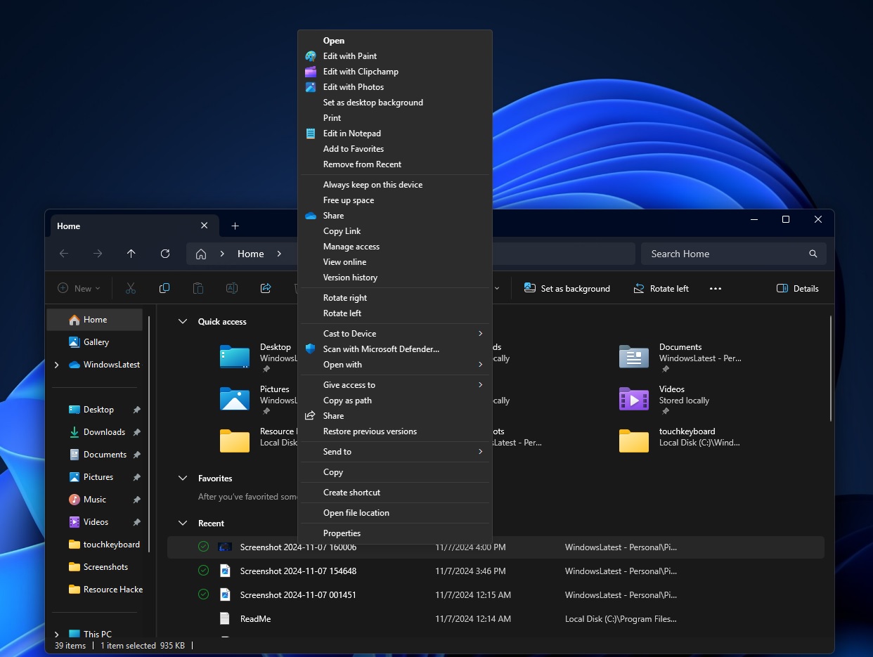

As you can see in the above screenshots, the modern context menu has a problem.
It now displays options like “Edit with Paint,” “Edit in Notepad,” and “Edit with Clipchamp” directly instead of grouping them under the “Open with” option. It also seems unclear if Microsoft is doing this intentionally because we do not see third-party apps getting their own space.
Microsoft’s approach to exposing its apps directly via the context menu contributes to the clutter, as these options could have been placed within the “Open with” submenu.
The irony is that reducing clutter was one of the reasons behind killing off the classic context menu in favour of the modern design.
In Windows 10, for example, context menu would often get quite lengthy and take full screen view in some cases. Microsoft said it would address those concerns with the redesign of the context menu, but that doesn’t seem to be the case anymore.
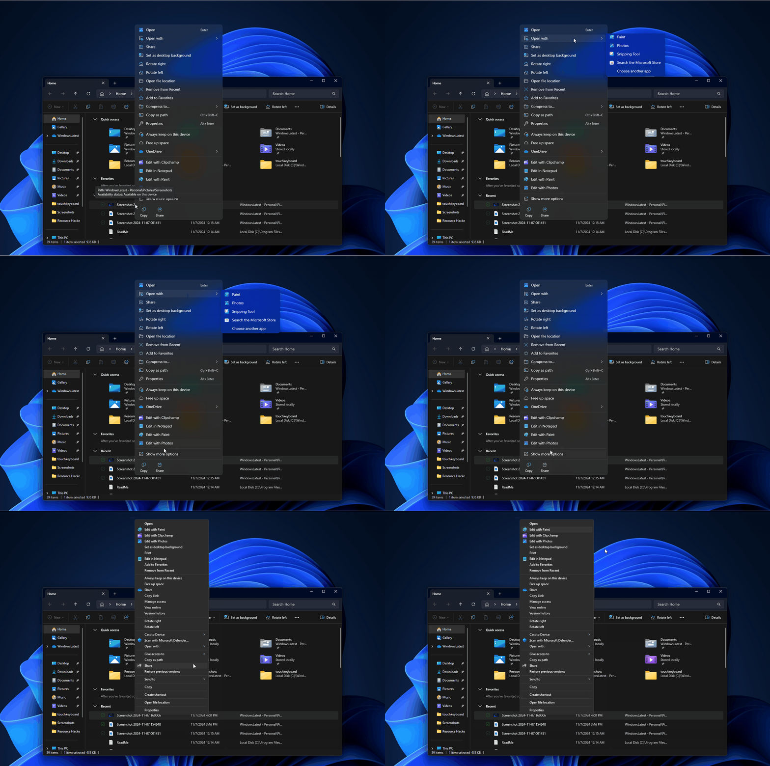

In fact, it’s the opposite because not only the new context menu is now cluttered, but also slower than the classic version. On Feedback Hub, many have complained that the context menu takes longer than usual to show up.
Sometimes, it also renders broken with options spreading out of the allotted space. This has been observed after Windows 11 24H2.
Windows Latest has also observed performance issues with these menus. While the modern menu has gotten a lot faster over the past few years, it’s still not that close to the performance of the Windows 10 context menu on low-end hardware.
In terms of design, Windows 11’s modern context menu is somewhat better and looks “modern” due to the Fluent transparent background, rounded corners, and softer visuals.
But will the company ever get the performance and clutter issues right?
