Back in February we told you about
a UI design change that was seemingly coming to the Android version of Google Maps. This fresh look replaced full-page UIs with sheets allowing a user to view in the background more of the map showing some of the area that he or she is navigating. The goal is to keep at least part of the map showing in the background throughout the app. These maps can be closed by tapping on the “Exit” icon (looks like the letter “X”) located next to the Share icon. But
Google pulled the redesign not long after it appeared.
According to
9to5Google, these changes are returning to some Android handsets as Google appears to be testing the redesigned UI once again. There are some additional changes to this version of Maps as the double-backed sheets seen in the new look being tested back in February have been replaced by single sheets. Doing this gives the app a cleaner look leaving a little more information for users to view in the background.
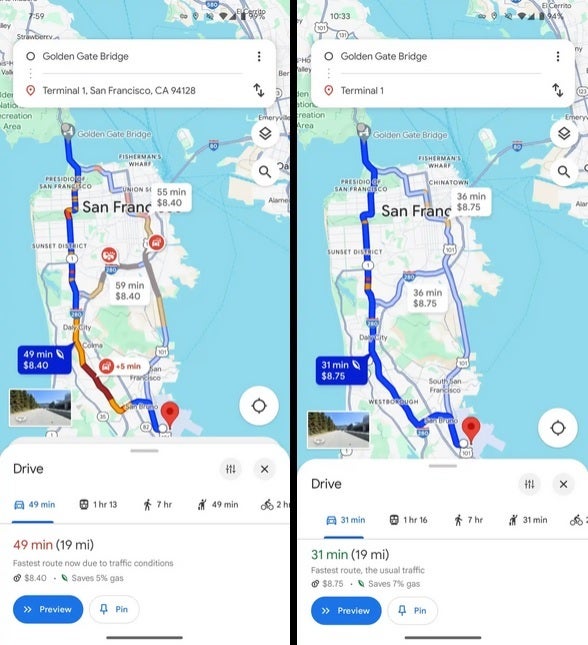
Current Google Maps UI on left, redesigned UI on the right
Another change occurs at the top of the Google Maps display where the top now only has two fields. One field includes the location where the navigation starts and another field shows where the navigation ends, also known as your destination. The fields are no longer edge-to-edge and the mode of transportation options such as driving, public transit, walking, ride-hailing, and cycling are moved to the bottom of the display.
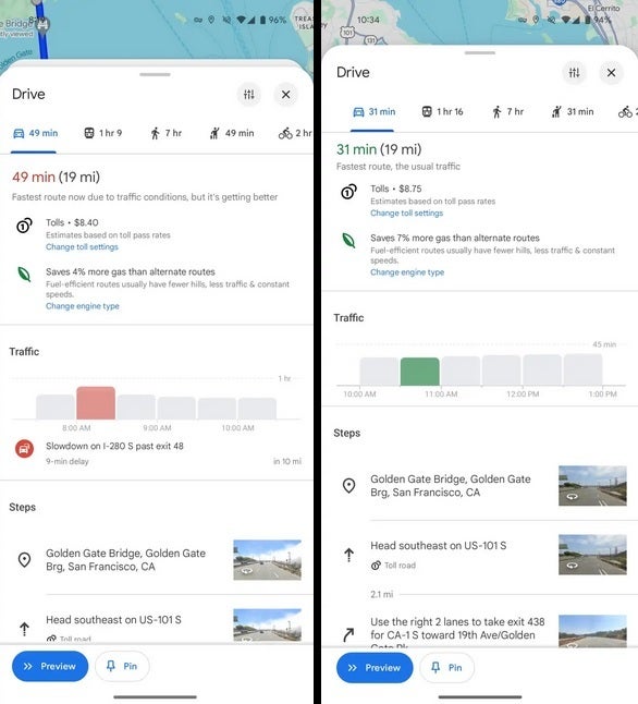
Current Google Maps UI on left, redesigned UI on the right
The redesigned UI has been spotted on version 11.127.x on the Android version of Google Maps although it still appears to be a server-side update and the build seems to be a rare commodity at this point. My
Pixel 6 Pro running the latest
Android 15 beta does not have this variant of Google Maps yet and is running version 11.126.0103. You can check to see which version of Google Maps is running on your phone by going to
Settings >
Apps >
Google Maps; scroll down to the very bottom of the page to see which version you have.
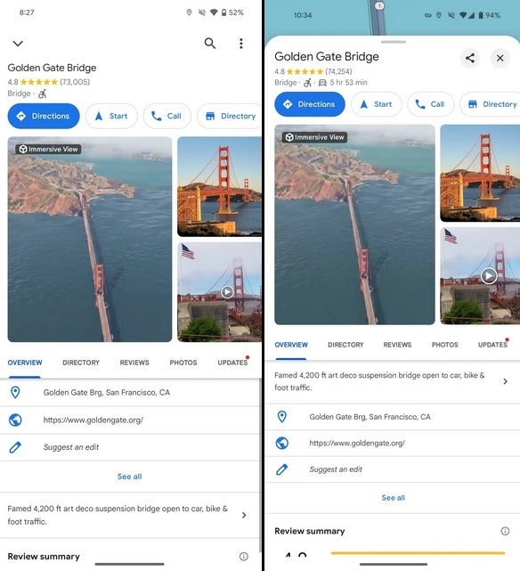
Current Google Maps UI on left, redesigned UI on the right
Hopefully, Google decides to stick with the redesigned Google Maps version and disseminates to all Android users instead of playing the “here today and gone tomorrow” game that the company is fond of.
Source Link Website
