Most people prefer to hold their phones in portrait orientation. It is easier to hold a smartphone using one hand and based on my experience, holding the phone in landscape just does not feel as secure. Still, for some activities, such as streaming video, holding a phone in landscape mode is preferred because of the wide-angle view that the video is shown in. According to Mishaal Rahman writing for
Android Authority, Google is making some changes to
Android 15 to placate those who prefer to have their phone in landscape mode.
As Rahman notes, you can not rotate the lock screen with stock
Android 14. With the notifications page, you can go into landscape but you’ll notice that while notifications make up about 70% of the page in that format, the width of each notification takes up less than half of the space allotted for each one. Besides leaving plenty of wasted space, the look of the page is just downright ugly. The top third of the page consists of four Quick Settings edit buttons placed side-by-side.
With the current UI of the notifications page in landscape, you need to swipe down once to see elements that are otherwise hidden such as the brightness slider on the top of the page, the settings shortcut, a shortcut to the power menu, the Quick Settings edit icon and more.
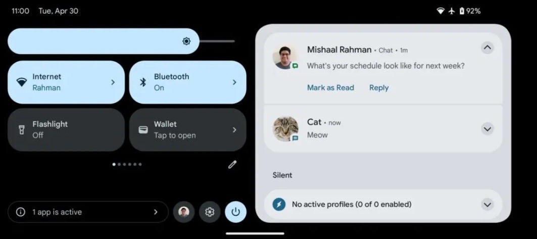
The Android 15 notifications page in landscape after Google disseminates the new UI
What Google is doing is changing the notifications page in landscape to make use of all of the previously wasted space and is no longer hiding the aforementioned hidden elements so that they are always in view and can be quickly accessed if needed. The new look will show four Quick Settings buttons in a 2 x 2 look with the brightness slider appearing all of the time.
Your notifications, the Quick Settings edit icon, the power menu shortcut, the settings shortcut, and more are also on the screen at all times instead of being hidden and requiring another swipe down to view. Rahman says the new look of the landscape notifications page resembles a version of the notification page for tablets reduced in size.
Rahman adds that the landscape-optimized UI for the lock screen is still a work in progress with some minor bugs that still need to be worked out. If you like using your
Android phone in landscape, you will be happy to see
Google iron out all of the wrinkles and push out the improved landscape notification UI and the new landscape-oriented lockscreen page.

