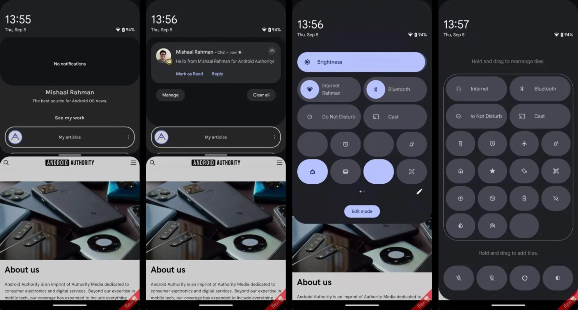
Android 16 notification panel uncovered | Images source — Mishaal Rahman (Android Authority)
The most notable change is the way users will access the quick settings panel. Instead of a second swipe down, users will need to perform a two-finger swipe. This alteration could be met with resistance from users who have become accustomed to the current one-swipe access.
It’s important to note that the design is still in its early stages and may undergo further refinements before the final release. However, it’s clear that Google is contemplating a substantial overhaul of these core Android features.
This shift towards separate panels could enhance user experience by providing clearer distinctions between notifications and quick settings. The return of the partial-screen notification panel could also improve multitasking capabilities. However, the two-finger swipe requirement for quick settings might prove to be a controversial change.
As Android 16 development progresses, we’ll likely gain further insights into the final design and functionality of these revamped panels. It is also possible that with close to a year before we even see the Android 16 beta, many changes have yet to take place as Google refines the UI. It remains to be seen how users will respond to these changes, but it’s clear that Google is striving to evolve and improve the Android user interface.
