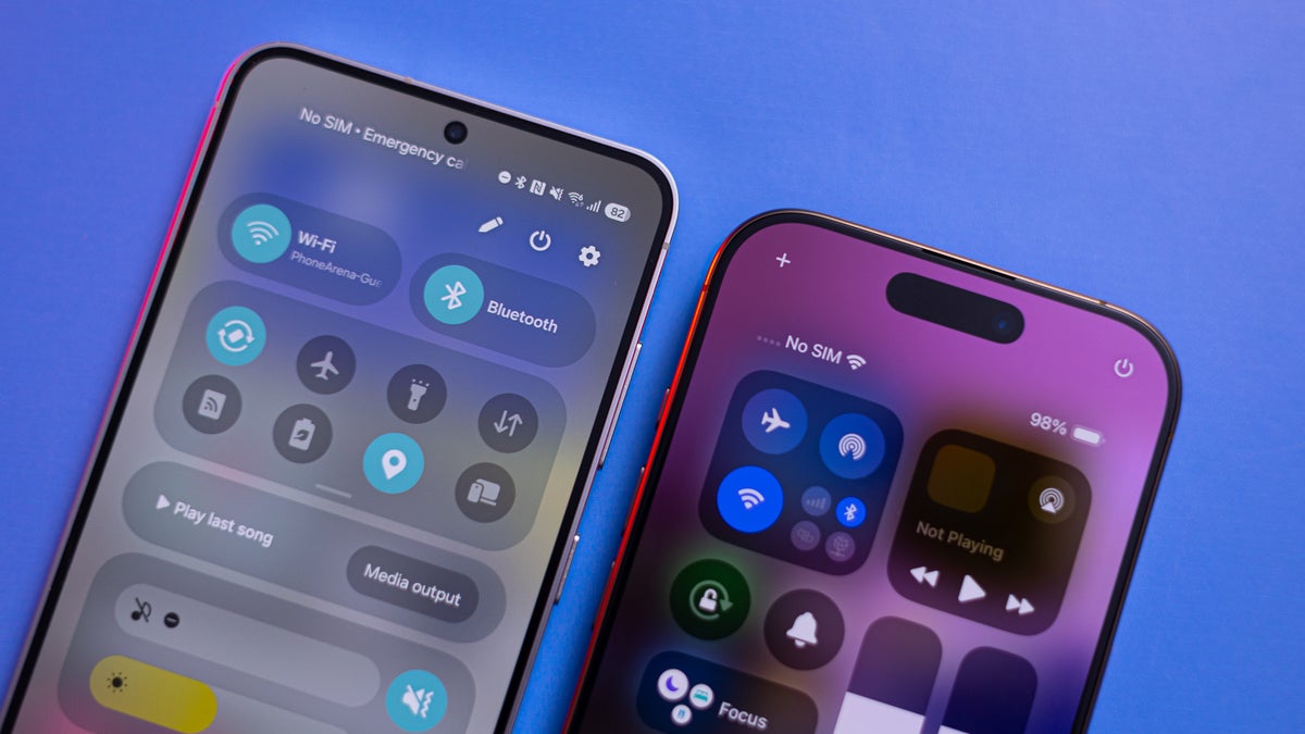
And, for what it is, it’s a pretty fresh visual upgrade. With some new icons, cleaner animations, some more customization options, a redesigned Quick Toggles UI that looks a lot like an iPhone Control Center, a redesigned battery icon that looks like an iPhone’s battery icon, a Live Activities widget that looks a lot like an iPhone’s Dynamic Island… Wait, hold on a second!
Live Activities and Now Bar
The new One UI 7 will have Live Notifications, meaning they will be dynamic mini-widgets in the form of a notification, showing you currently ongoing tasks. Like timers, voice recording, music playback, charging progress, and so on. Much like how Apple’s Dynamic Island that surrounds the camera cutout is a live widget that shows you currently active tasks.
Now, Samsung’s take is a bit different. On the lockscreen, the Now Bar is at the bottom, easy to tap and swipe with a thumb if you just pick up the phone with one hand. When you unlock it, you will see the Live Notifications button all the way on the top left — you tap it and you get the Now Bar expand over the top of the screen.
It’s a slightly different take with more thought put into ergonomics. But it very strongly evokes the Dynamic Island feels.
Quick Settings panel
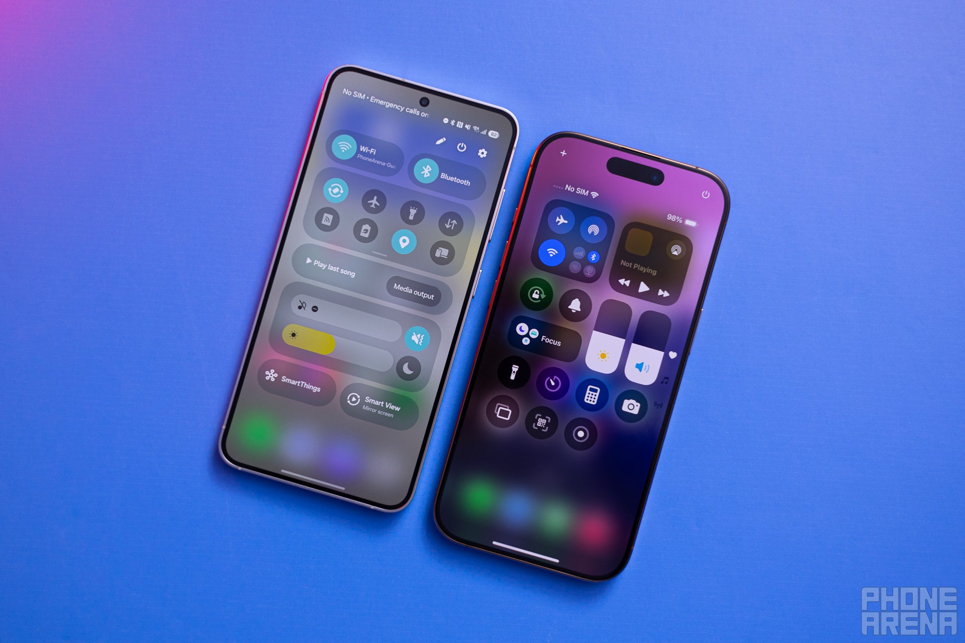
Just change something up? Gotcha, we are going to keep our sliders horizontal (Image credit – PhoneArena)
Again, Samsung put a spin on it by allowing you to expand collective toggle folders and make them as big as you want them to be.
You can also call the Quick Settings up instantly by swiping from the top-right of the screen (instead of a double swipe down), much like iOS has been doing for some years now. One UI 6 used to be able to do that, too, but it’s not a default setting — it’s called Quick Settings instant access and can be found while editing your Quick toggles’ arrangement.
In any case, we can’t say there’s a clear winner here. Both Samsung and Apple’s Quick Settings / Control Center are getting a bit too elaborate and complicated for a feature that’s supposed to give you quick access to simple things. We presume most users will leave these at default, or slightly tweak them and not tinker with them too much.
Lockscreen clock and widgets
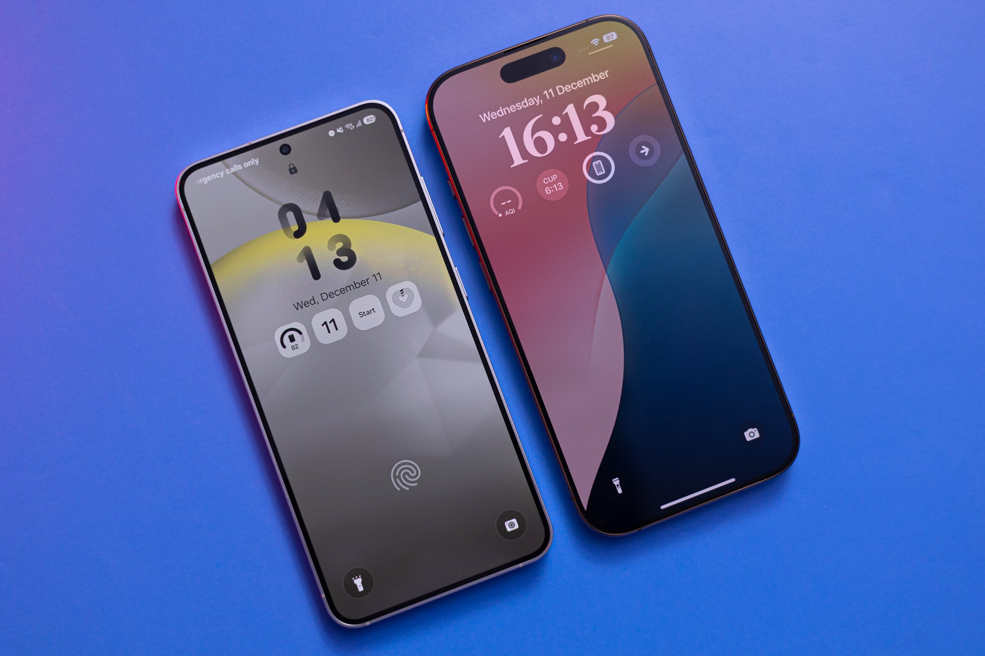

Quick – which phone is which? (Image credit – PhoneArena)
No complaints here, though. The new style is very clean, modern, informative, and customizable. It was one of the good things that Apple did for iOS’ quality of life featureset, and we are happy to get to enjoy it on Galaxies as well.
Speaking of the lock screen –
Lockscreen media player
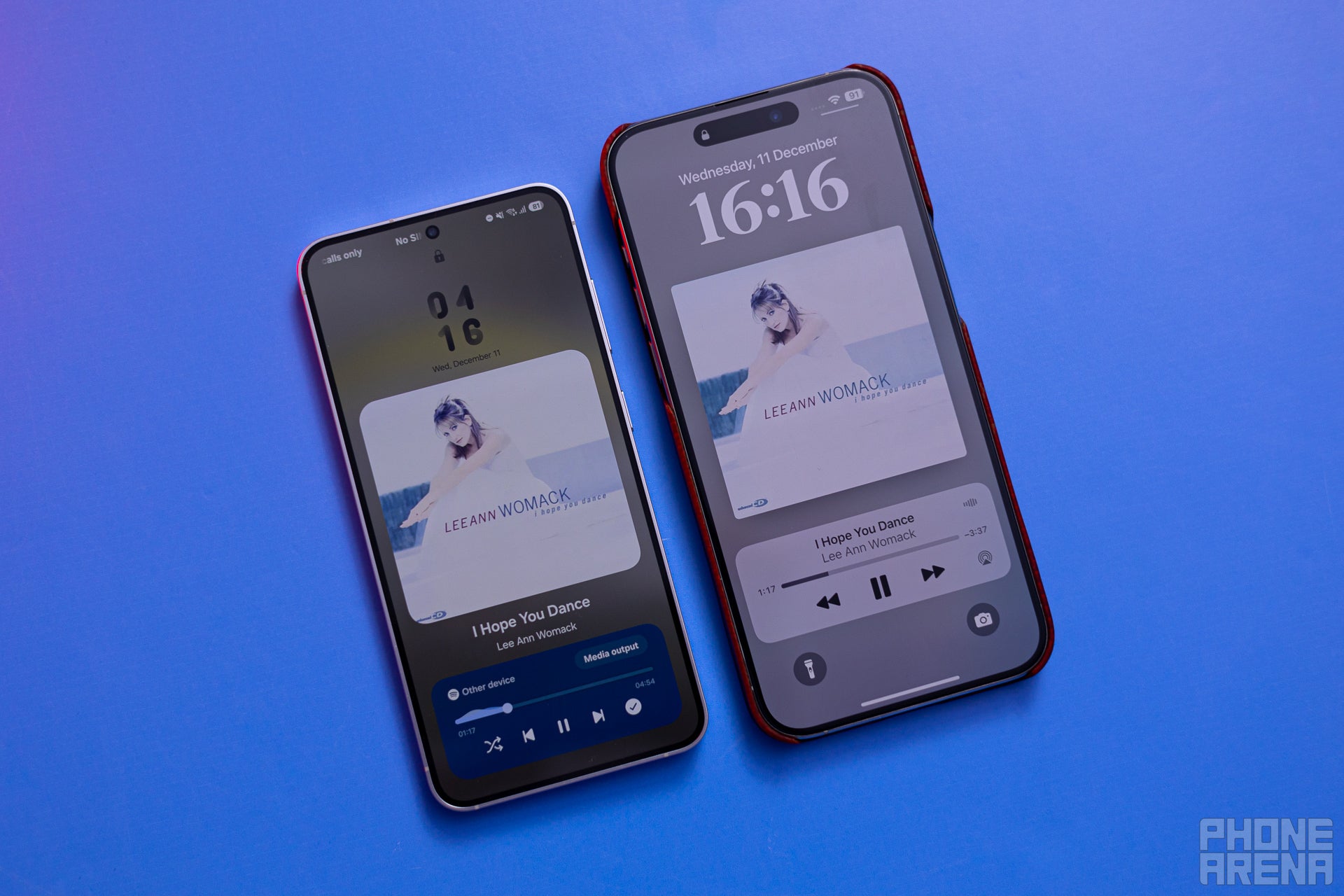

Pretty callback to the mp3 players of the past (Image credit – PhoneArena)
While playing music with the phone locked, your entire wallpaper switches to show you the album artwork, with the media playback controls near the bottom of the screen for easy access. Am I describing One UI 7 or iOS 18 here? Ha! It’s both!
Before this, One UI only showed you a rectangular notification for music playback, with cropped artwork. The new style is definitely more captivating, but also definitely borrowed from how iPhones have been doing it for a while.
And since we are still on the lockscreen –
The Always-on display has gotten a glow-up
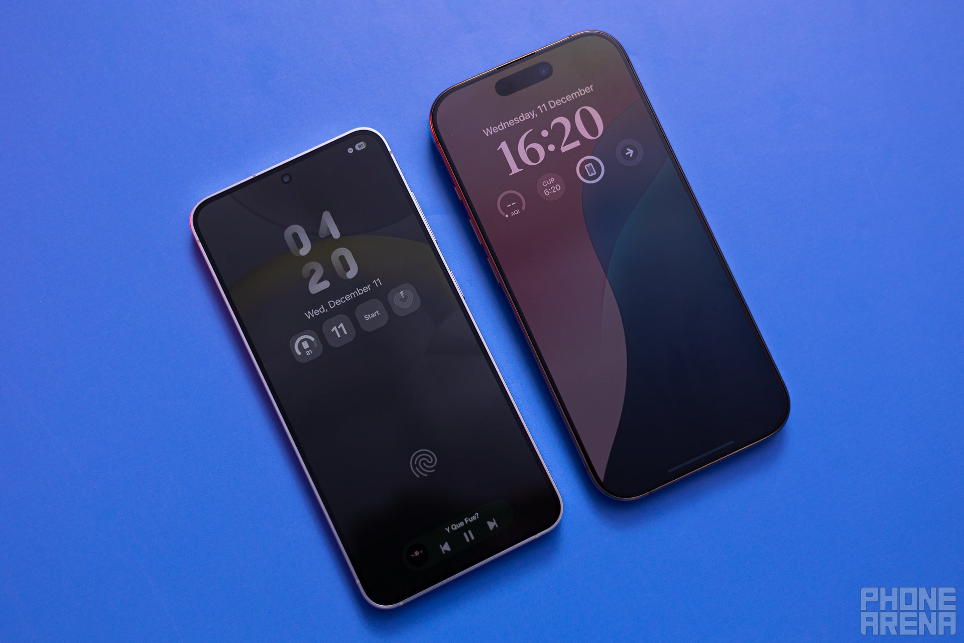

Dimly lit – turn your lockscreen into a speakeasy (Image credit – PhoneArena)
In fact, there were enough negative comments and reviews that Apple actually now gives you the choice to have a “boring” old all-black Always-on mode, with just a clock and notifications on it.
Battery icon
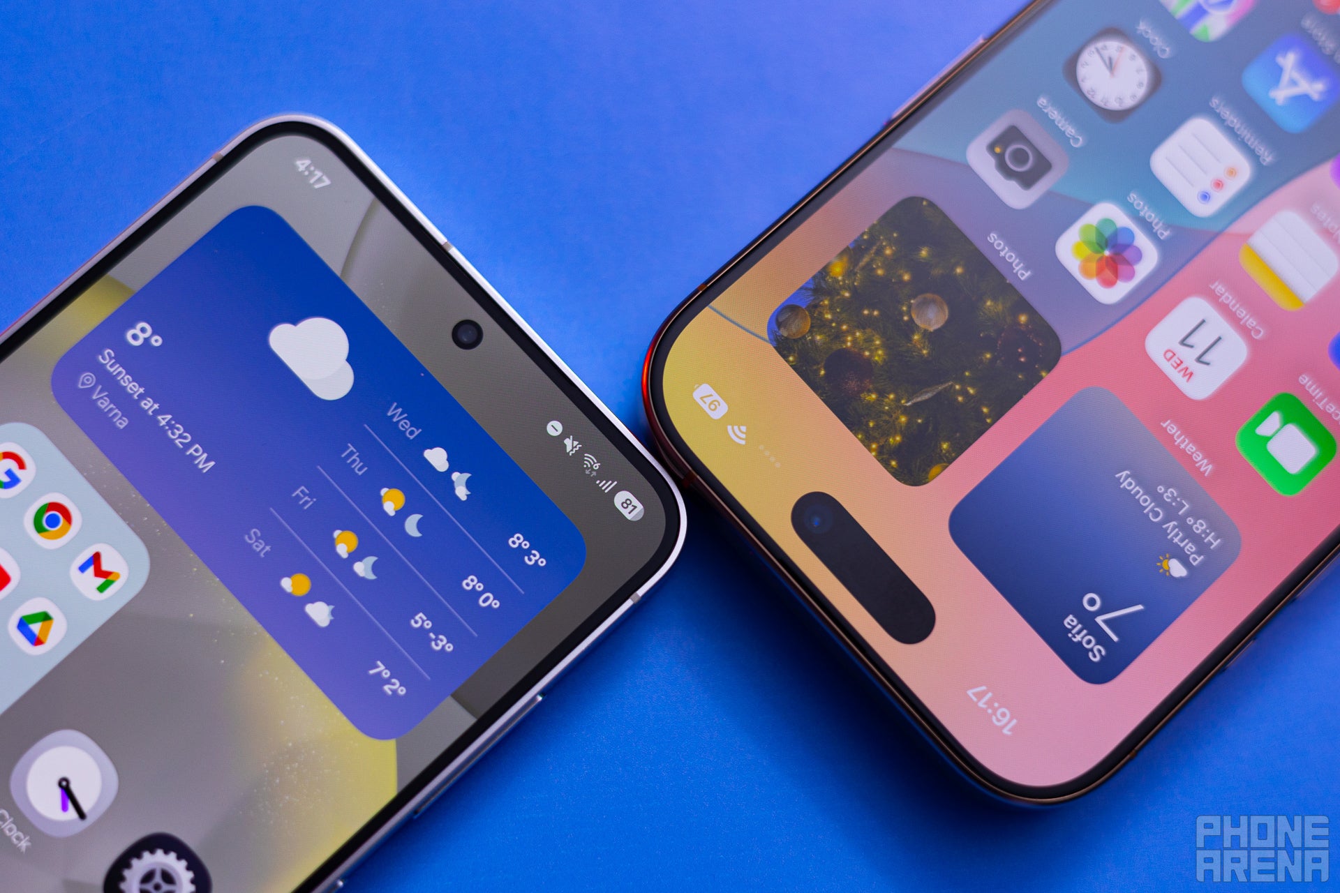

Neat, pretty, basically the same (Image credit – PhoneArena)
Another visual upgrade that has been a long time coming. Thus far, Samsung used to show you battery status with a single vertical battery icon in the top right. If you enable battery percentages to be visible, they would sit next to the battery icon, taking more space in your notifications bar. Definitely an outdated look for 2024, that’s for sure!
In One UI 7, the battery icon turns sideways, and percentage numbers will be shown inside. The shape of the icon and the way it lights up green while charging definitely looks very iOS-ish. But we are just happy it got modernized!
Recent Apps carousel
Lastly, the Recent Apps carousel got a visual update. It still functions much like before — you get a “Close All” button and a row of suggested apps based on your usage at the very button. The carousel itself has just been slightly visually tweaked. Instead of swiping through different windows of your recently-used apps, you will now sift through what looks a stacked deck of apps. This one looks very iOS.
What do you think?
Here’s a small bonus round. Those of you that have used iPhones since the Great iPhone X Redesign may know that there was no easy way to turn the iPhone off. The “power button” wasn’t exactly that — since the Home button was now gone, the side key became the Apple Pay / Siri button, so holding it down didn’t call up the power menu. The only way to turn your iPhone off was either to go to Settings -> General -> Turn off, or do a combination that goes Volume Up -> Volume Down -> Hold power (very few people know that one!).
Samsung tackled a similar problem, but gave you the ability to turn off the phone with a “power off” button, easily accessible in the notifications shade. Why are we going on this tirade? Because with iOS 18, Apple has actually copied that tiny little feature and finally given us an easy way to turn an iPhone off. Crazy, right?
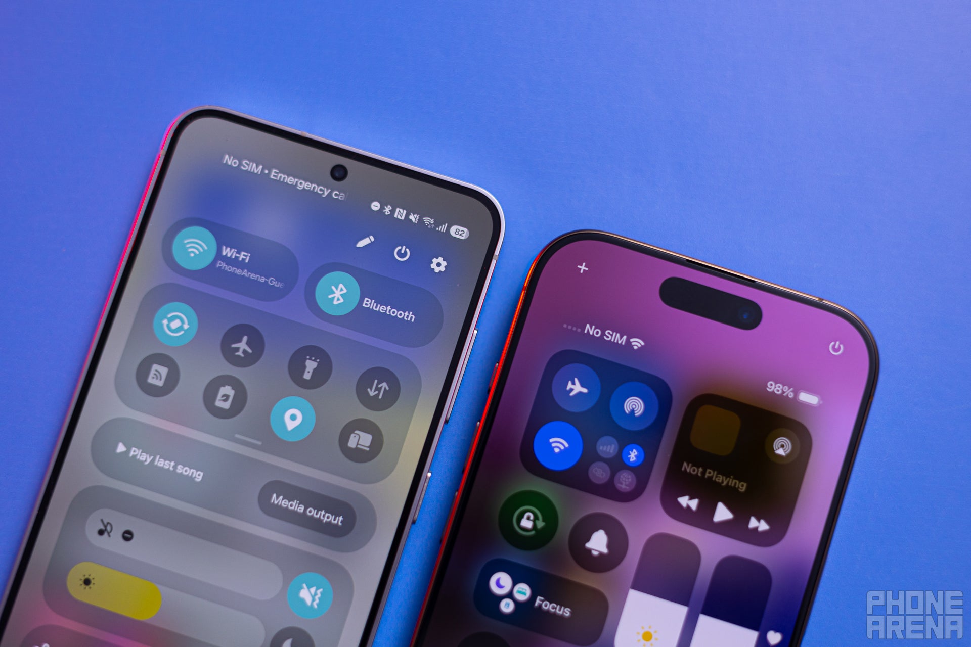

Blink and you’ll miss it — tiny “power off” button is now on the iPhone (Image credit – PhoneArena)
Back to One UI 7, though. Has Samsung went over the top here, or are these welcome refreshments? We do believe that Galaxies are striving to make onboarding easier to anyone that chooses to switch from an iPhone for the first time. That aside, the visual upgrades do look lovely and modern. Most places where Samsung got an idea from Apple’s interface — it developed further and added an extra spin to it.
On the other hand, are we in danger of waking up one day in a world where every smartphone looks, operates, and feels the same? Some thoughts to shudder to!
