The app might soon feature a two-column layout
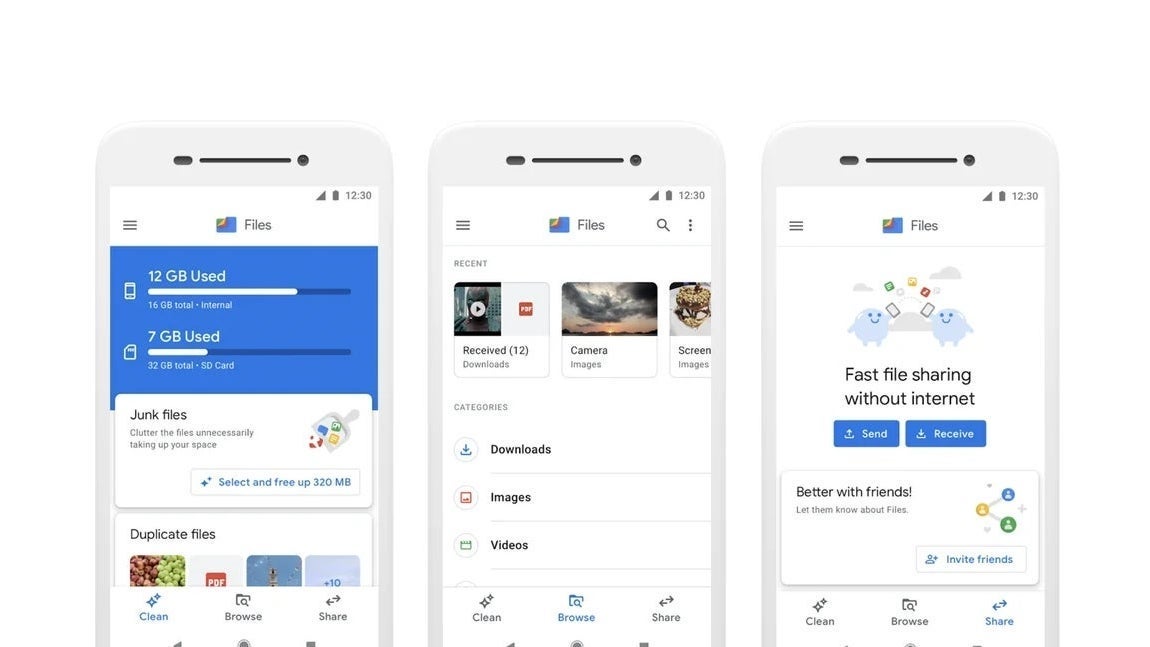
According to a recent report, Files by Google is experimenting with a revamped interface for tablets and other large-screen devices like book-style foldable phones. This new design introduces a two-column layout, allowing users to access more files simultaneously without flipping through different pages.Right now, Files by Google just expands its mobile home page UI to fit larger tablet and foldable screens. You can still access the search bar, Recents carousel, Categories, Collections, and All Storage options. Still, it jumps to a different page when you select a file or folder.
The upcoming UI update changes things by placing all the home page elements in a column on the left while the selected folder or category appears on the right. This new layout promises a much better advantage of the bigger screen, allowing you to browse through your files more smoothly without needing to constantly return to the home page to access a new folder or category.
Files by Google UI before (the first two images) and after. | Image credit – Android Authority/AssembleDebug
When you interact with the search bar, it still brings up a full-screen search UI. However, the context menu now appears in a smaller column on the left. Plus, the Scan button has been shifted to the bottom right corner of that left column, making space for more buttons in the right column.As the report indicates, this new UI in Files by Google is available in version 1.4831.672243909.0, but it’s only for devices running Android 15. This means it might not make its way to Android 14, suggesting it’s tied to updates brought by the latest OS version.
I think shifting the app’s layout for better functionality on larger screens is a savvy move. With foldable phones gaining traction and tablets increasingly used for productivity tasks like document editing, project collaboration, and file access, this change would be a great addition. If Google goes through with it, it’ll be a welcome upgrade.
