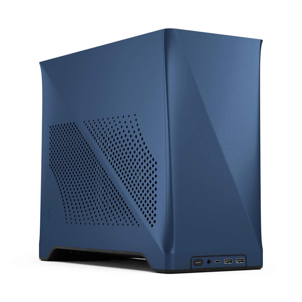
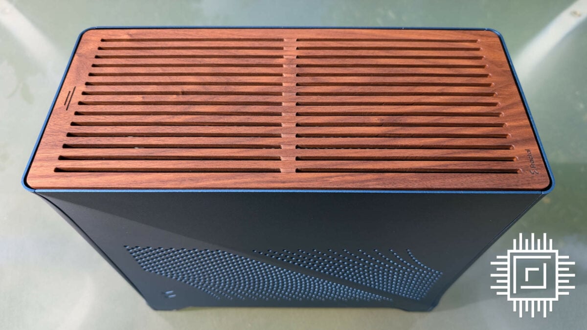
It’s been four years since Era ITX hit the scene, a case whose cool appearance sadly didn’t translate to its thermal performance. Since then, however, Fractal Design has busied itself with improving its SFF designs, and the company is now ready to launch a souped-up successor: Era 2. Unsurprisingly, it’s a triumph.
For those familiar with Fractal Design’s recent efforts, namely North, Mood, and Terra, the influence of prior cases is plain to see here. Behind its stunning exterior is an amalgamation of lessons learned from the aforementioned models. The result is a chassis whose brains largely match its beauty.
Specification
Era 2 is larger than its predecessor, with a volume of 18.9L compared to the 16L of its forebear. This increase is mostly due to its relatively longer 366mm body but it’s also slightly taller too thanks to its new feet. Of course, size isn’t everything. This case may be bigger but it’s still a small-form-factor (SFF) chassis through and through, and one that’s a cut above Era ITX overall in both form and function.
Of course, a longer chassis leaves room for beefier hardware. This case somehow finds room for graphics cards as large as a GeForce RTX 4090 Founders Edition. While I’d caution against putting something so enormous and power-hungry in a build this small, it’s still awesome to know that it’s possible.
| Fractal Design Era 2 | |
|---|---|
| Dimensions (L x H x W) | 366 x 314 x 165mm |
| Weight | 4.64kg |
| Motherboard support | Mini-ITX |
| PSU support | SFX/SFX-L |
| Fans | Fractal Design Aspect 12 (x2) |
| AIO compatibility | Up to 280mm (top) |
| Max. CPU cooler height | 70mm |
| Max. GPU dimensions (L x H x W) | 326 x 137 x 63mm |
| Colour options | Charcoal Gray / Midnight Blue / Silver |
| Price | £194.99 ($199.99 / €219.99) |
However, this feat comes with a few caveats as your ability to fit such wide graphics cards will depend on the height of your CPU cooler. We only have 70mm to play with at most, and that’s with a GPU 48mm wide. To get those extra 15mm for our pixel pusher, we’re left with just 55mm for our processor. This limits our air cooler options but thankfully still provides enough room for AIO pumps and tubing.
On the front, I/O looks the same, but Fractal Design has bumped port specs to more modern standards. From right to left, there’s a solid assortment of two USB 3.0 Type-A inputs, USB 3.2 Gen 2 Type-C, a 3.5mm audio jack for those still rocking cans, and a customary status LED.
Design
At a glance, Era 2 looks the spit of its predecessor but there are several changes both stark and subtle that help differentiate it for the better. For instance, the pattern of the ventilation cut-outs on either side panel that mirror one another are far more interesting to the eye. Better still, their greater number and wider spread allows more air to flow in and out of the case. I wish Fractal had designed them with dust filters.
Turning our attention to the front, I’m glad to see I/O moved to the bottom-centre of the case. Looking back, the prior placement looks awkward by comparison. Acute curves on the left and right of the panel stave it from a boring boxy look, instead giving the chassis a premium, refined appearance. The small ridge on every panel is particularly pleasing in that it gives Era 2 a two-tone look as light bounces differently on each half despite its uniform colouring.
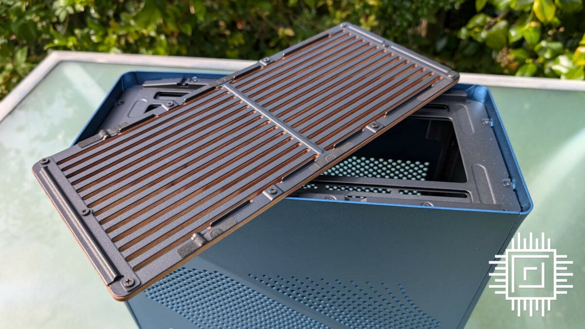
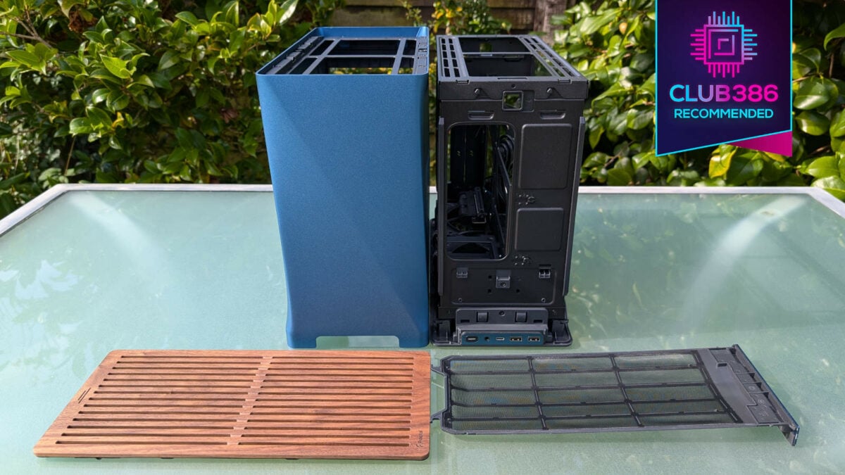
Up top, we find a gorgeous, magnetic walnut panel. This wood element pleasingly contrasts to the rest of the case’s aluminium body. The effect appears stronger on the silver and charcoal grey models, looking at photographs of each, but it’s still a lovely effect on our midnight blue unit, nonetheless. Upon unveiling I’d assumed silver/grey would be the way to go, but seeing the blue in the flesh has changed my mind; Fractal once again proving there are other ways to fashion a PC without gaudy RGB.
I’m glad to see the previous block design ditched in favour of cut-outs for Era 2. Not only does this make the case more breathable, but seeing light bounce between the perforations provides another welcome contrast to the darker tones of the wood. It’s super easy to remove, too, requiring a small push at its rear.
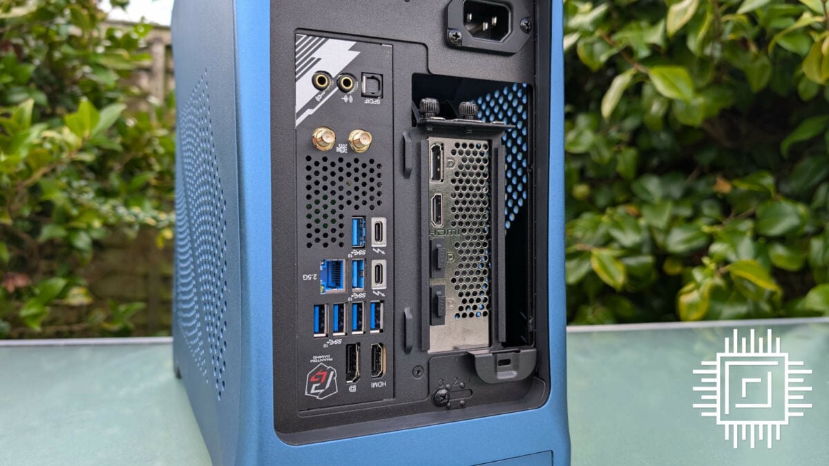
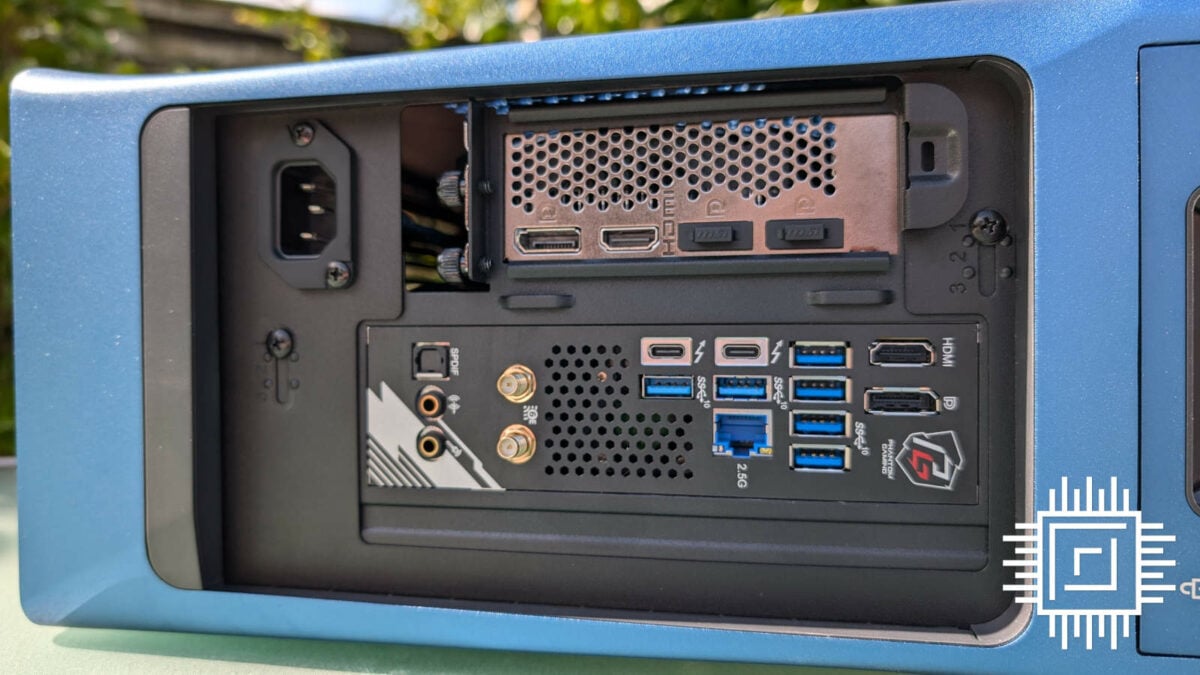
While you wouldn’t spend much time looking at the rear of Era 2, it does have a questionable quirk that hasn’t left my mind’s eye. With a build now inside it, it surprises me to see gaps in the case above and around my graphics card. Compounding the aesthetic issue, there’s no dust filter here, either.
Save for this issue, though, it’s difficult to fault the exterior design of Era 2. This is a case that exudes quality through its aesthetics and materials, making it practically perfect for any environment you’d want to put it in.
Building with Era 2
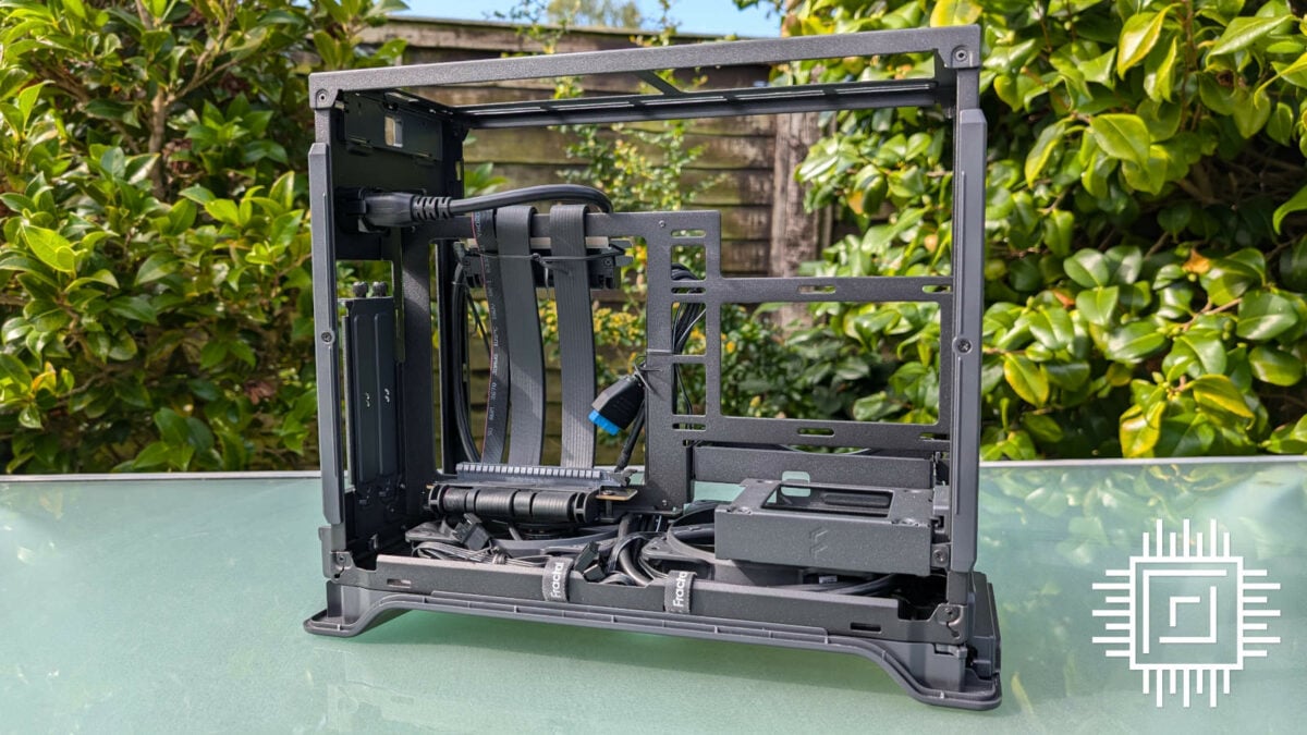
Era 2 is easy on the eyes but it’s thankfully mostly a breeze to build in, too. Peeking behind the panels, this case is a far cry from the internals of its predecessor and has far more in common with Mood and Terra.
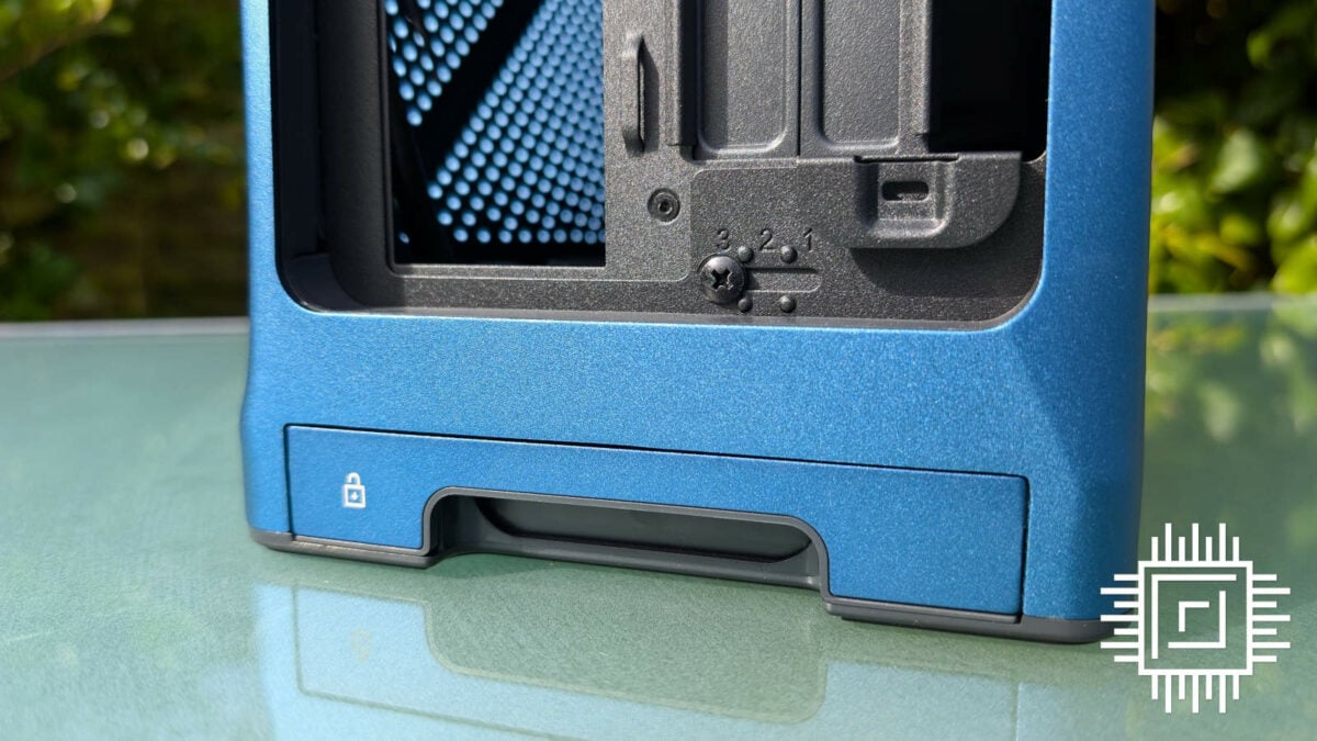
Getting inside the case doesn’t require any tools. Instead, the shell clings to the frame by its bottom dust filter, which also acts as a locking mechanism. Removing it with a small tug, you can then lift the chassis away, providing access to the build. Putting everything back together is as simple as repeating these steps in reverse, culminating in a satisfying click. Not as dramatic as Terra’s gull-wing side panels, but every bit as effective.
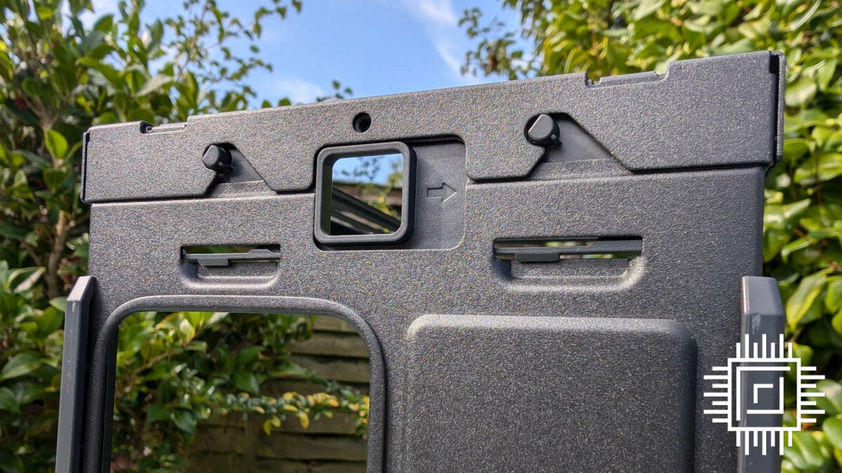
Accessible as either side of the case is in this state, Fractal Design includes an additional measure to improve the ease of building. Either side of the top panel are two spring-loaded locks, that you can push to free the top bracket from the frame. Not only does this allow for independent installation of additional fans or up to a 240mm radiator, but it also gives you another angle from which to access a build.
Running down the middle of Era 2 is an adjustable spine, like the one seen in Terra. However, it only offers a choice of three positions instead of seven. The case arrives in position ‘3’ by default, which prioritises GPU spacing and cooling, with ‘2’ serving as a balance of the two, and ‘1’ affording the most breathing room for the CPU.
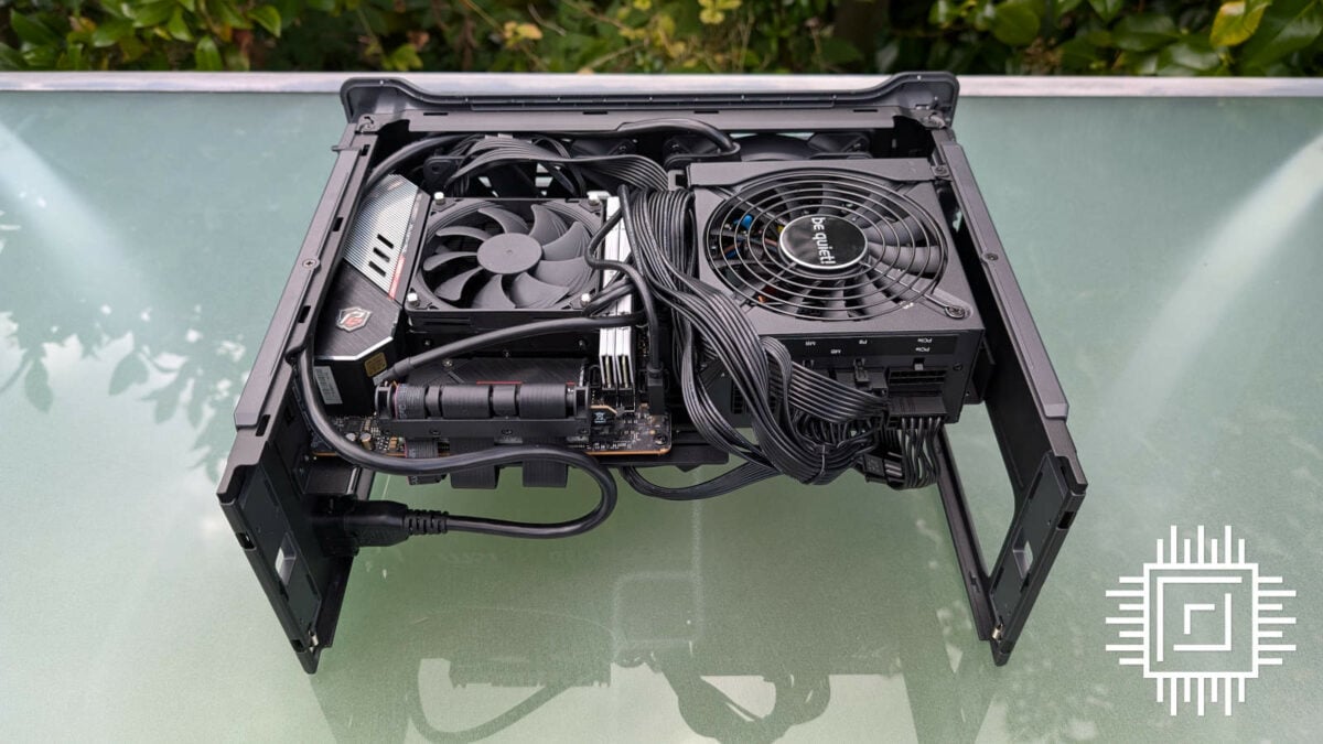
Laying the case on its side, our ASRock Z790 PG-ITX/TB4 motherboard fits like a glove atop the included standoffs. Of course, I pre-installed our Intel Core i5-13400F processor, Noctua NH-L12S cooler, and RAM, as Fractal Design rightly recommends in its user guide.
Connecting the Era 2’s included Fractal Design Aspect 12 fans to our board did admittedly takes a little more finesse than I was expecting. Threading the daisy-chained PWM connector through the underside of the spine is easy enough, but marrying pins to headers is more difficult. This is partly due to the inverted layout of the case, leaving you with little wiggle room for your fingers, but you can easily remedy this through a little more preparation and pre-connecting.
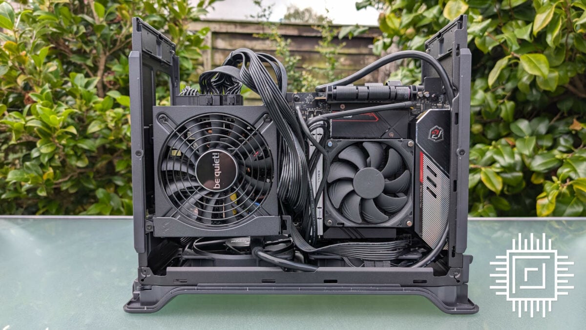
Speaking of which, good planning will serve you well when it comes to cable routing and installation from your power supply. Getting at that eight-pin CPU port isn’t an easy task. If possible, long and thin cables are best. The stock wires from my be quiet! PSU unfortunately aren’t lengthy enough to wrap around the case’s spine for a tidy finish, leading to a big clump of unsightly black spaghetti that I can’t wait to hide away.
To be clear, Era 2 only supports SFX and SFX-L power supplies, whereas the original Era could house an ATX unit at the expense of overall hardware compatibility. This is a common trend for ITX builds and given the increase in availability of high-quality SFX supplies, easy to stomach if you’re already thinking of building in a case of this size.
By default, the case comes installed with a 2.5in drive bay. As my system uses M.2 storage, I uninstalled the dedicated sled by removing a single screw to give my GPU all the room it could wish for. While the option is nice to have, I wonder if it’s time to let this form factor go, particularly in SFF builds where M.2 makes a lot of sense.
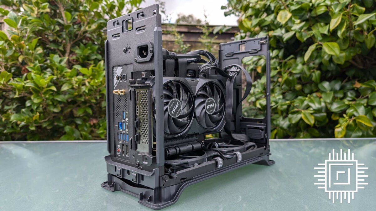
With that bay out of the way, connecting my GeForce RTX 4060 to the preinstalled PCIe 4.0 riser is an effortless task. A card of this size also affords me a convenient dumping ground to route some cables. However, if you envisage more meat in the graphics department, I did install a larger Radeon RX 7800 XT with zero issues. There’s ample room to play with.
Fractal Design offers a few cable management tips in its manual and highlights tie down points to go with the supplied cable ties. For those that strive for neatness, this should prove invaluable. As for me, I’m content to fit and forget, especially when there’s no pesky tempered glass panel revealing the guts of my system.
Even with a mess of wires pouring from the spine of Era 2, the top bracket and shell return to their resting places with no fuss. To put to rest any anxieties, the sliding mechanism is plastic on both chassis and frame, so there’s no danger of slicing any wires or causing any damage to the case itself.
Performance
Normally, this is the part of the review where we’d discuss noise and temperatures. Unfortunately, our test build has run into an unexpected and highly frustrating error. Despite repeated attempts to troubleshoot the problem, it simply doesn’t want to play nice. The RAM works just fine in another system, we’ve tried different modules, the CPU has been reseated, and even CMOS has been reset to no avail. Answers on a postcard, please.
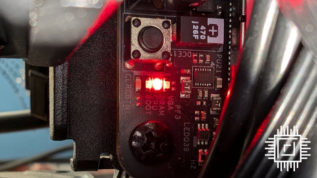
Sadly, there wasn’t enough time to get a replacement up and running. We have a new set of components en route, and we’ll update this review in due course. For now, though, I’d expect noise and temperature values in the region of Terra given the many similarities between the two cases.
If these predictions hold water, it should make Era 2 a massive improvement over Era ITX. Stay tuned!
Conclusion
There’s plenty to love with Era 2 and you’ll need plenty of pennies to pay for one too, with prices set at £194.99 ($199.99 / €219.99). Thankfully, no colour in the lineup carries an added premium. This makes it slightly more expensive than Terra, which I feel is a fair ask given the added convenience of its construction during the build process.
As you’d expect from a Fractal Design enclosure, you get what you pay for. The quality of the case, frame, and build experience is top notch. It looks great too, of course, whether as part of a gaming setup or as a living room PC.
When the only major complaint I can lodge at Era 2 is its lack of dust filters, it’s clear that the case is doing so much right. One could say Fractal Design has entered a golden era. This would be both figuratively and literally if the company had pushed out an appropriate colourway. It seems only appropriate given the circumstances.
Fractal Design Era 2
Verdict: An improvement on its predecessor in every way and a great SFF case in its own right.
Pros
Brilliant build quality
Beautiful materials
Easy build experience
Supports big GPUs
Riser cable included
Cons
Not enough dust filters
Tricky to tidy cables
Buy
