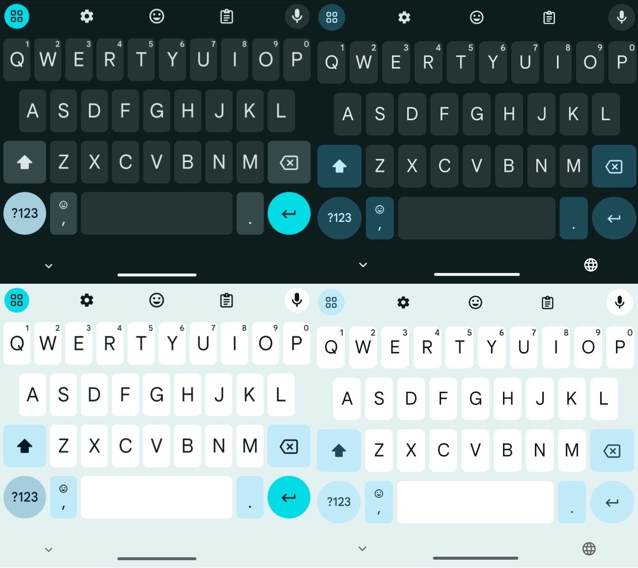
Gboard’s old versus new dynamic color changes in dark and light mode. | Image credit — 9to5Google
This updated dynamic color theme is currently only available on the latest Gboard beta (version 14.7.10.x). Even then, it’s not widespread. Across several Pixel phones used for testing, the new theme only appeared on one device. This suggests that Google is still in the early stages of testing this new design and it may be a while before it rolls out to all users.
It’s worth noting that this change only affects the dynamic color themes. The “Default” themes, which only accent the enter key, remain unchanged. This gives users the option to stick with the old look if they prefer.
This is just one of many updates that Google has been making to Gboard in recent months. The company has also been working on improving the keyboard’s performance, adding new features, and expanding support for more languages.
The change seems so subtle that I’m not sure why it’s being done. However, I appreciate Google’s efforts in making the UI more appealing. I’m interested to see if this update will make a noticeable difference in my daily use of Gboard. It’s possible that this more unified color scheme could be less distracting while typing, but I’ll need to use it for a while to see if it makes a real difference. I’m always happy to see companies like Google experimenting with new design ideas and trying to improve the user experience.
