Custom theme for the Search bar widget
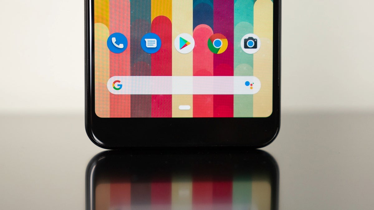
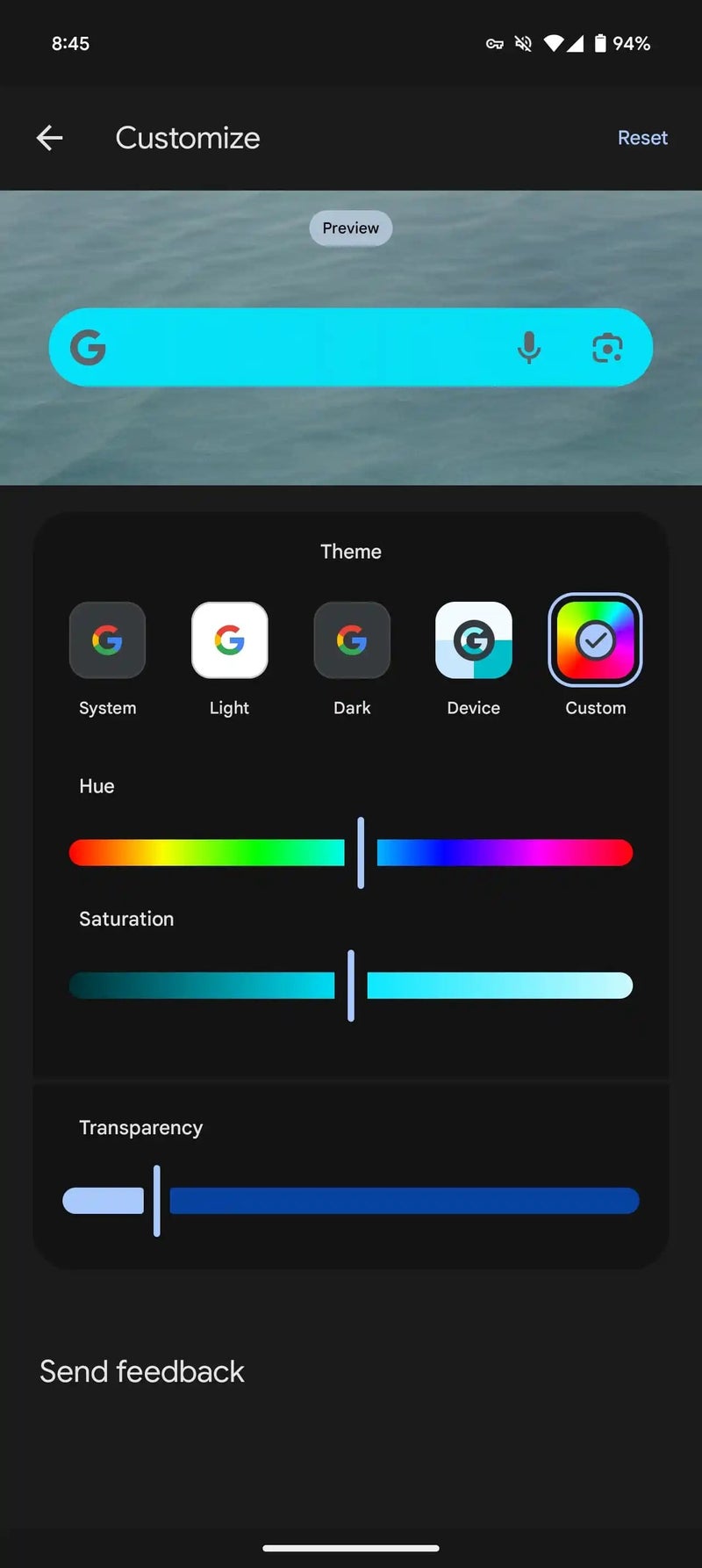
In August, Google gave the Search bar widget’s Customize screen a makeover, ditching the hue and saturation sliders for simpler theme options like System, Light, Dark, and Device (Dynamic Color). The only tweak left was a transparency slider.But now, a new report reveals that the latest Google app beta (version 15.43) is bringing some of those lost options back. A new Custom theme has popped up, reintroducing the hue and saturation sliders so you can fine-tune the widget’s color to your taste once again.
These sliders now have a sleek Material 3 look, featuring a pill-shaped line and a separate vertical bar handle for easier adjustments alongside the Transparency control.
You can see a preview of how the Search widget will look like before applying any changes. | Image credit – 9to5Google
It looks like this update hasn’t landed on the stable channel just yet, but it could be rolling out soon. If you’ve got the latest beta installed, you can try out these new customization options by:
- Opening the Google app
- Tapping your profile picture
- Heading to Customize Search Widget
I think it’s great to see the color customization options for the Search bar widget making a comeback. After all, being able to style your Android phone just the way you like is always a win, right?
In other Google Search-related news, not long ago, Google made the iOS Search widget more useful thanks to cool customizable shortcut buttons. Plus, the tech giant has expanded the availability of its AI Overviews to more than 100 countries across the globe.

