He, however, is the exception that proves the rule: we, the majority of people, are not to be trusted; that’s why we rock phone cases.
This article isn’t about phone cases, though. It’s about what’s underneath. It’s about phones and phones’ colors.
Why? Well, go ask Pantone. And Motorola.
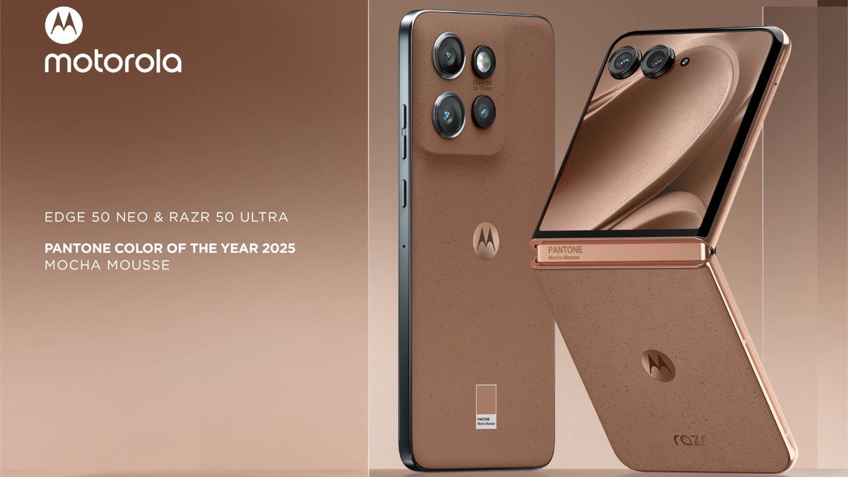
Of all the colors that the Pantone Color Institute could’ve picked for 2025, it went with Mocha Mousse. This is the Color of the Year 2025. Mocha Mousse is a shade of brown that looks quite tasty, actually… but doesn’t evoke a high-tech vibe.What I’m about to write today is pretty darn subjective, but so is every other personal opinion of mine around here.
Why not brown?
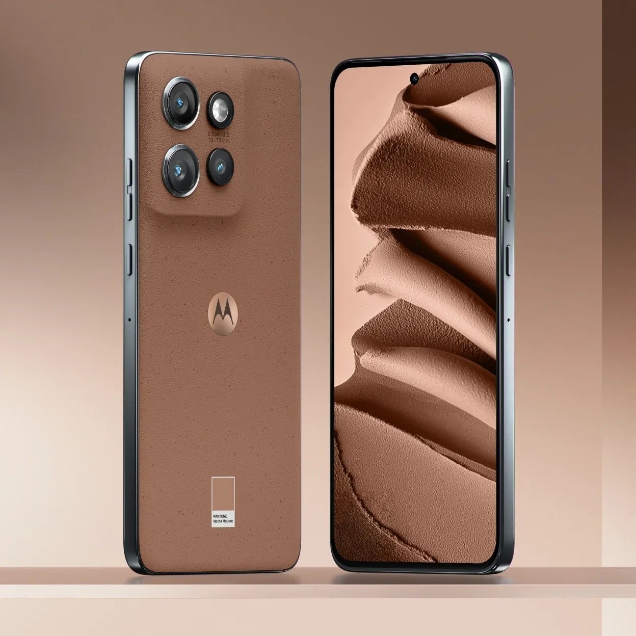
This could’ve been a futuristic shade of blue. | Image credit – Motorola
It’s not that I object to brown phones per se – I’ve seen people with brown phone cases here and there. Not bad. To each their own, I guess. Or, better yet, there’s a Russian proverb that goes (that’s a clumsy literal translation):
In color and taste, there is no comrade.
When I think of smartphones, I think they should (at least try to) look like high-tech gadgets. Classic and stylish black, deep space blue, spaceship-like silver, or some crazy, neon-like, bright mad hue.
Anything but brown.
A notable exception to that belief would be the wooden Motorolas that we’ve seen throughout the years. Wood is so unusual as a material for a phone’s back, but it works. It’s all about surprise.
How come Mocha Mousse is the color of 2025?
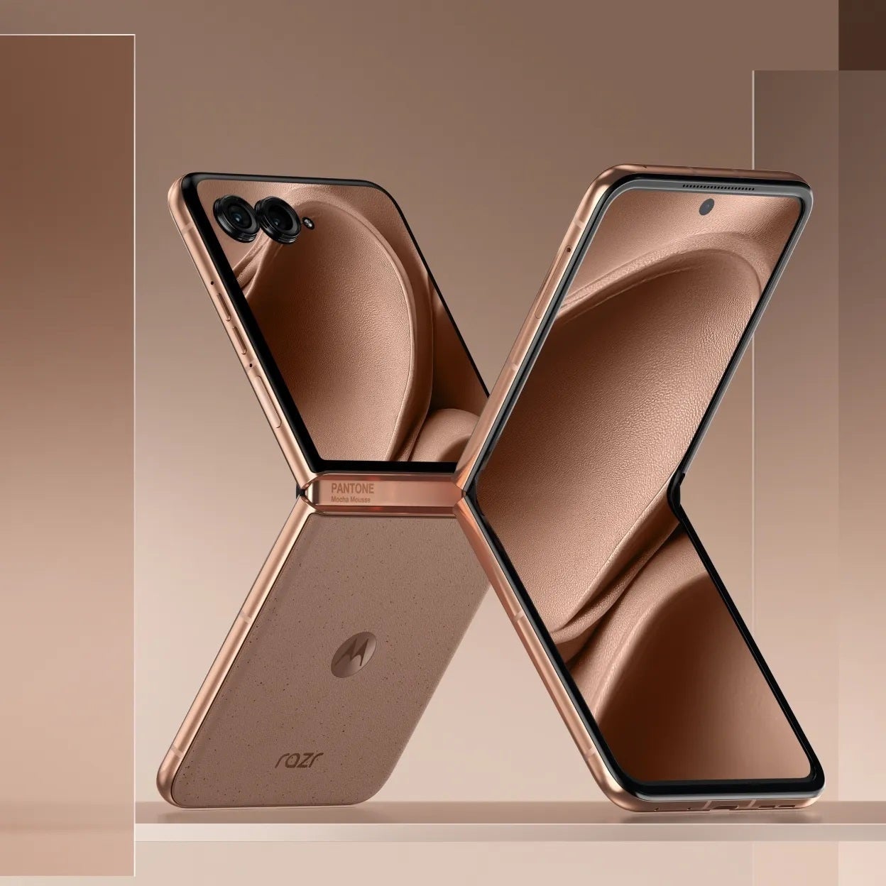

It’s stylish, but for a phone?! | Image credit – Motorola
Because of Trump. Hey, I’m not making this up.
Covering the Mocha Mousse story, CNBC quoted Ellyn Briggs, a brands analyst at Morning Consult. According to her, many Americans, especially women, feel “disconcerted” by the election results, and this sentiment is likely to shape shopping behaviors.
Laurie Pressman, vice president of the Pantone Color Institute, explained that Mocha Mousse’s deep richness and its warm, comforting qualities resonate strongly with our collective craving for comfort. Her words, not mine.
Apart from that, the Pantone Color Institute selected Mocha Mousse because it’s “a warming, brown hue imbued with richness”. They claim it “nurtures” people with its suggestion of the “delectable qualities of chocolate and coffee”, answering “our desire for comfort”.
That’s great, but do Motorola fans need to be “nurtured”?
Wait, are we going to get Mousse iPhones and Galaxy phones as well?
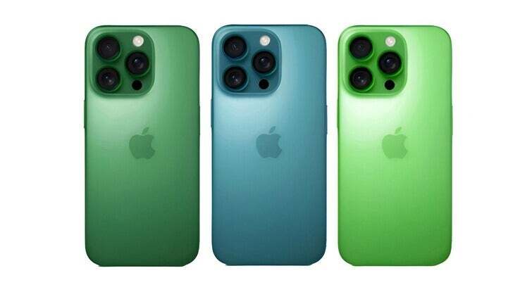

Pretty stylish, right? | Image credit – Majin Bu
Is this going to translate into getting chocolate-brown Apple and Samsung flagships? I think not. For one, the Pantone-Motorola partnership is well-established and there’s no time to switch cars in the middle of the ride.
Also, my gut (and my observations) tell me that Apple is not looking at the rich brown hues for the iPhone 17. The iPhone 16 came in Teal, Pink, and Ultramarine (among other colors) – and Teal, Pink, and Ultramarine are as far from Mocha Mousse as possible.
So far, the upcoming Galaxy S25 line is also far from the brown option:
The iPhone 17 Pro is rumored to be even further from the Mocha Mousse:
Quiet luxury, but not quite
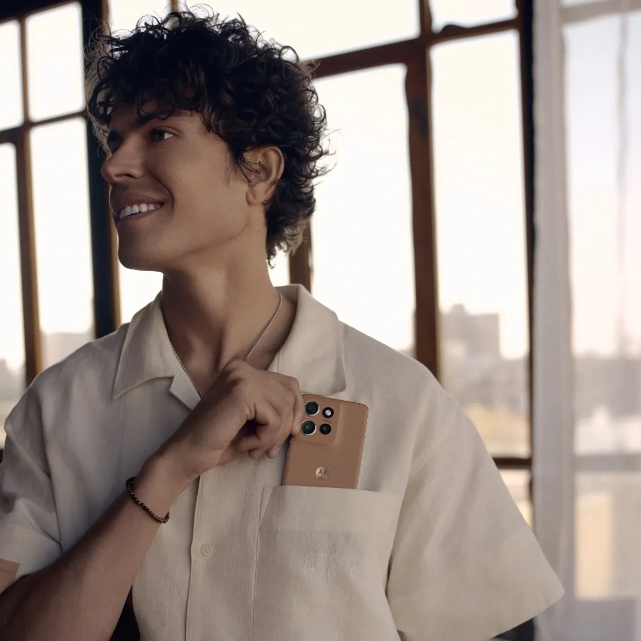

Image credit – Motorola
Pantone says that Mocha Mousse is “quiet luxury”.
While the hue by itself is pretty fly (for pants or coat, or some nice deerskin leather gloves), it doesn’t rock my boat when it comes to phones.
I prefer my “phone luxury” to manifest itself with specs, not with color of the back panel.
So, if there’s a Mickey Mouse-painted phone out there, but with a 10,000 mAh capacity battery, several 1-inch rear cameras, a dedicated shutter button, amazing glare-free display, a 3.5mm headphone jack (not that I need it so much, but just in case), and whatnot else, I’d take it in a heart beat.
Sure, I’ll slap a dull black case on it, because I don’t want to attract that kind of attention by waving around a phone with a cartoon character on it, but I’ll take the Mickey Mouse phone.
What about you?
