How to get the One UI 7 beta
To enroll in the One UI 7 Beta, you need to fulfill just a couple of requirements:
- The beta is currently live in Germany, USA, South Korea, with the UK, Poland, India, and China joining in the following days.
- Be on the latest One UI 6.1.1 software version (go to Settings>About phone>Software information, and find “Build number”, make sure that the build ends with “AXK4” and not anything else)
- Open the Samsung Members app, then go to the little “Inbox” icon immediately to the right of the search icon. Once inside the “Notices” tab, look if you’ve received а One UI 7 beta incoming message and follow the on-screen instructions to enroll for the beta.
- Wait a little and check for a software update by going to Settings > Software update, where a One UI 7 beta will hopefully be waiting for you.
One UI 7: The new features and changes
The first big change that you will notice with the One UI 7 update is the multitude of visual changes sprinkled just about everywhere. First things first, you will notice many new icons, which are now more colorful and sport significantly more character than the minimalistic ones from before. In particular, the Gallery, Phone, Contacts, Samsung Internet, Settings, and Camera ones have been spruced up.
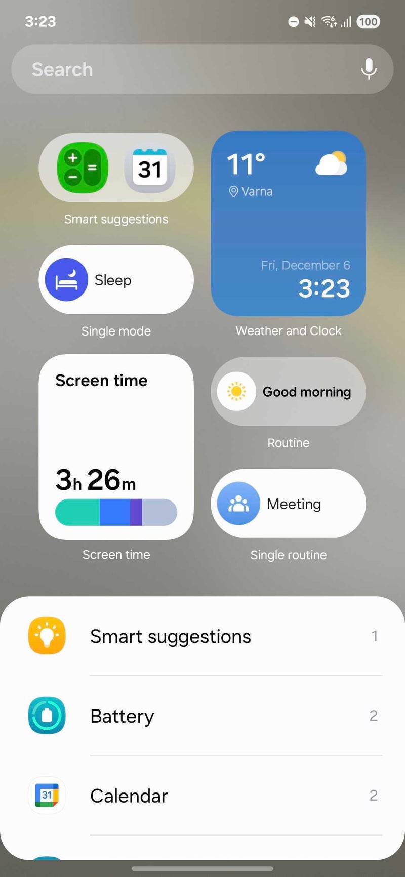
Most widgets have been revamped with more informative and colorful designs, but most have remained the same.
One UI 7 widgets
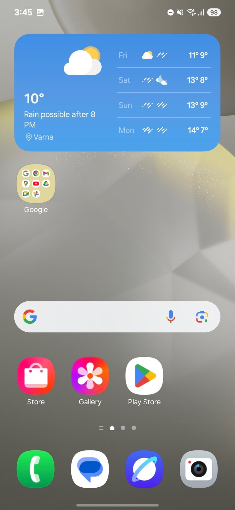
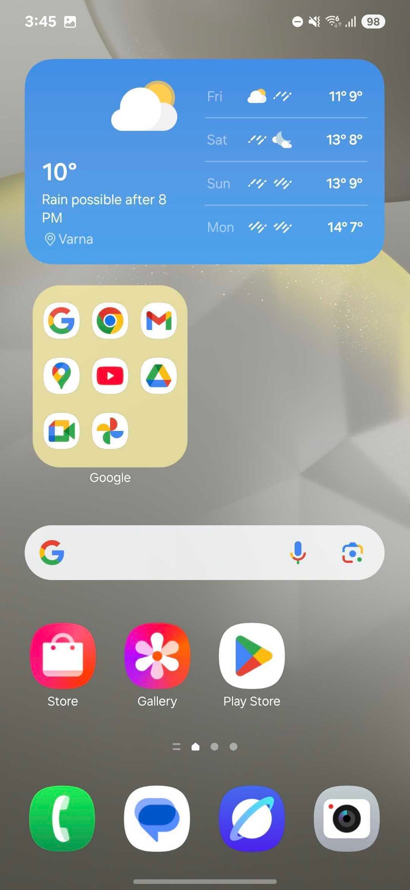
Folders now can be expanded on the home screen. This action transform the regular one-cell icon to a four-cell mini widget, but you can tap any of the small icons inside and open the respective app. This essentially provides you with access to eight app shortcuts (the ninth icon is reserved for a shortcut that opens the full folder).
Not a bad addition to One UI!
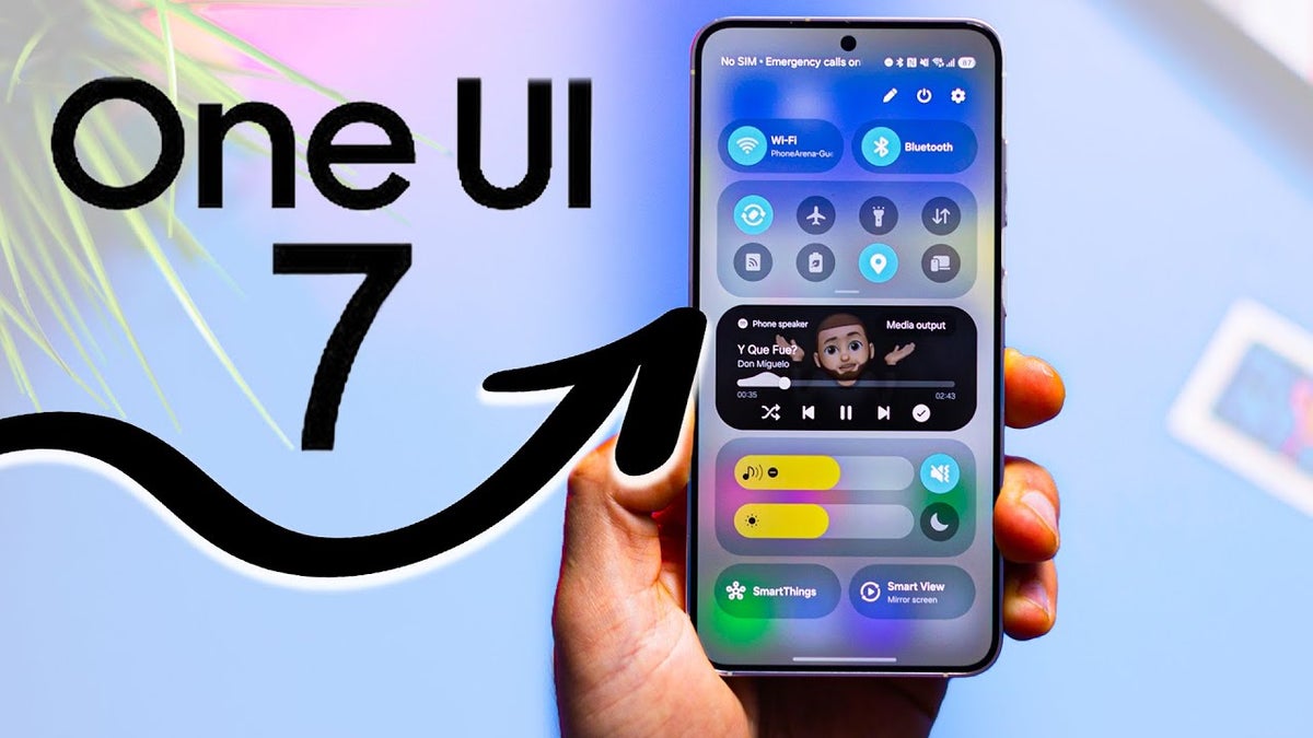
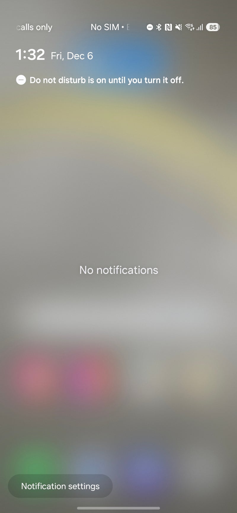
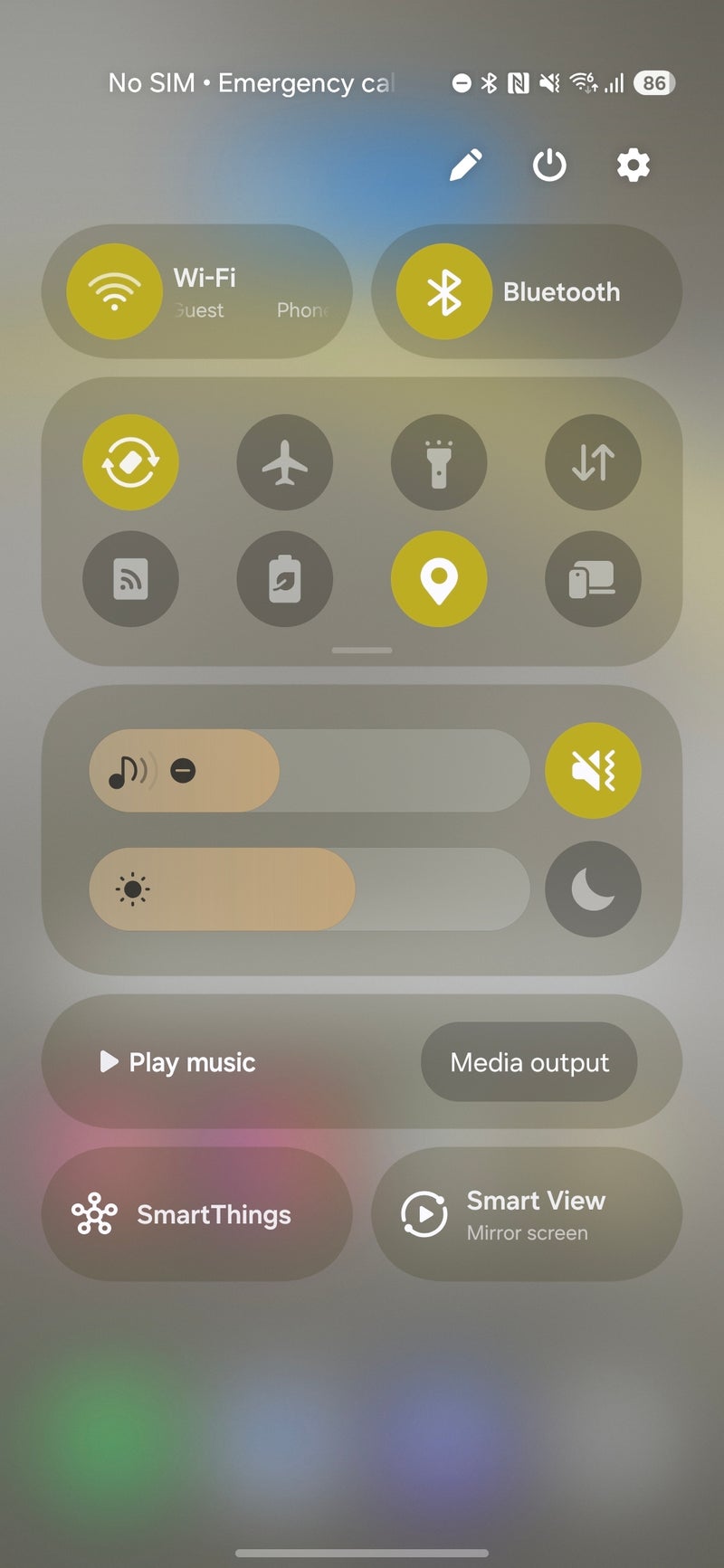
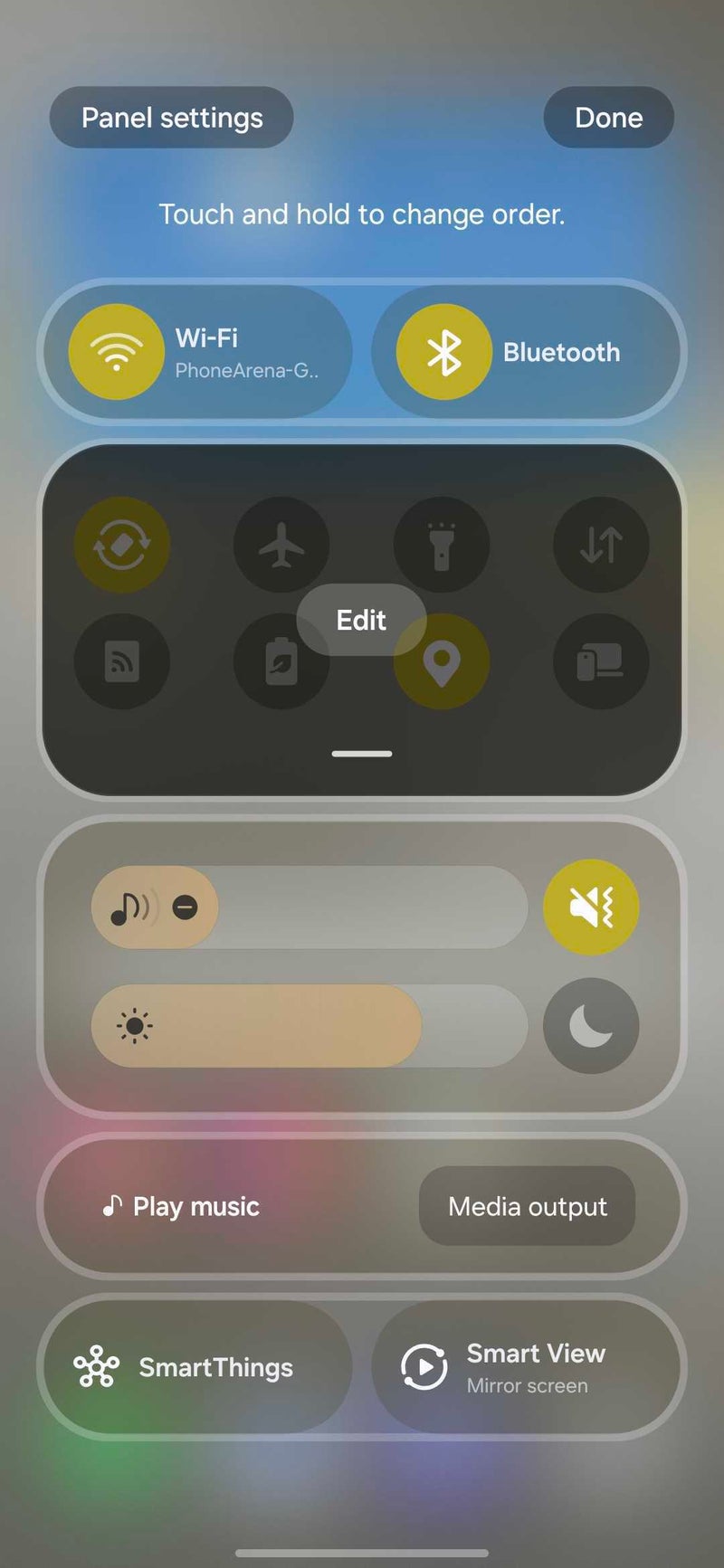
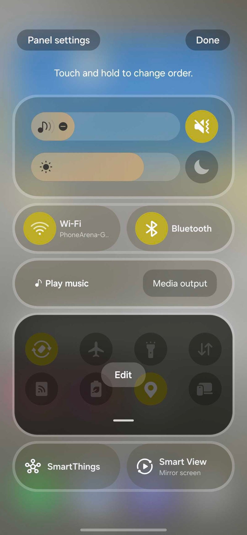
Next up, a major change can be observed once you swipe down on your screen. Samsung has reworked the quick toggles and notifications pane in a major way. With One UI 7, Samsung splits the two by default, with the quick toggles pane accessible with a top-right swipe down, while the notifications panel will open when you swipe down from anywhere else. Moreover, once you open the quick toggles panel, swiping down on the quick toggle folder expands it to reveal all of your quick toggles
Customization is back on the menu, boys!
The customizability is not as granular as on iOS, but that’s a good thing: the different sections are anchored together, so you can’t really leave an awkward blank spot anywhere. As an iOS user, I dread customizing my Control Center as the experience can quickly turn into a nightmare for a person with OCD, so kudos to Samsung for taking an idea and implementing it better. Samsung needs to add the ability to remove single tiles, though.
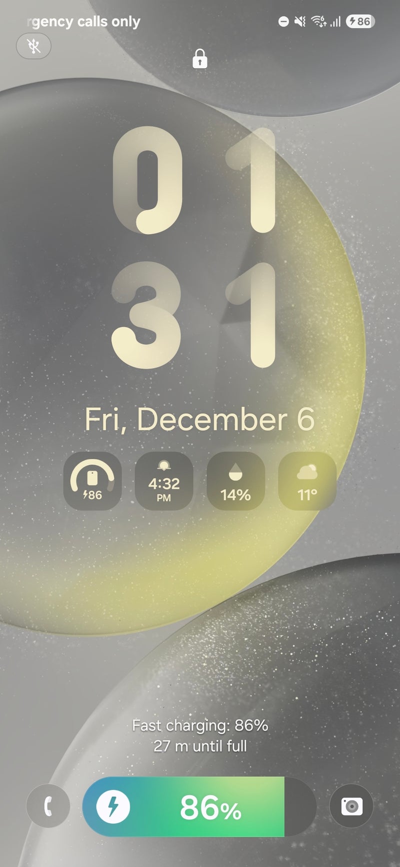
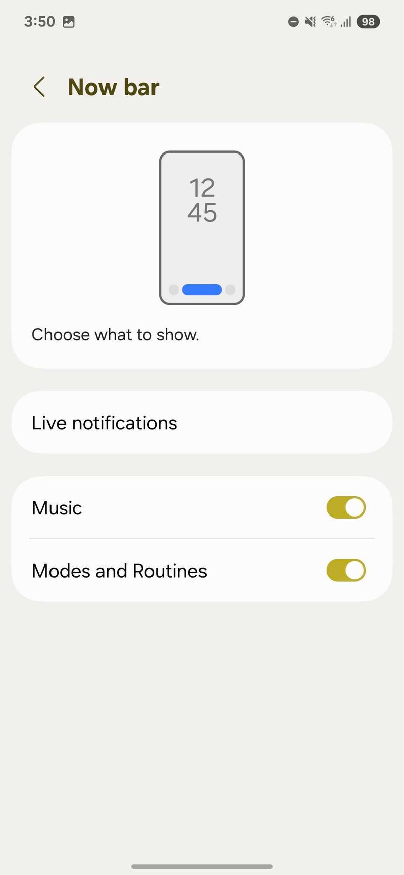
There’s a new so-called Now bar available for both the lock screen and the always-on display. This one lives at the bottom of the lock screen/always-on display between the icon shortcuts, and similarly to iOS’ Live Activities, it shows continuously running notifications, like music playback, modes/routines, and charging, as well as live notifications from clock, voice recorder, Emergency sharing, Samsung Health, Interpreter, Maps, Samsung Notes, and Bixby.
The Now bard is a cool new addition
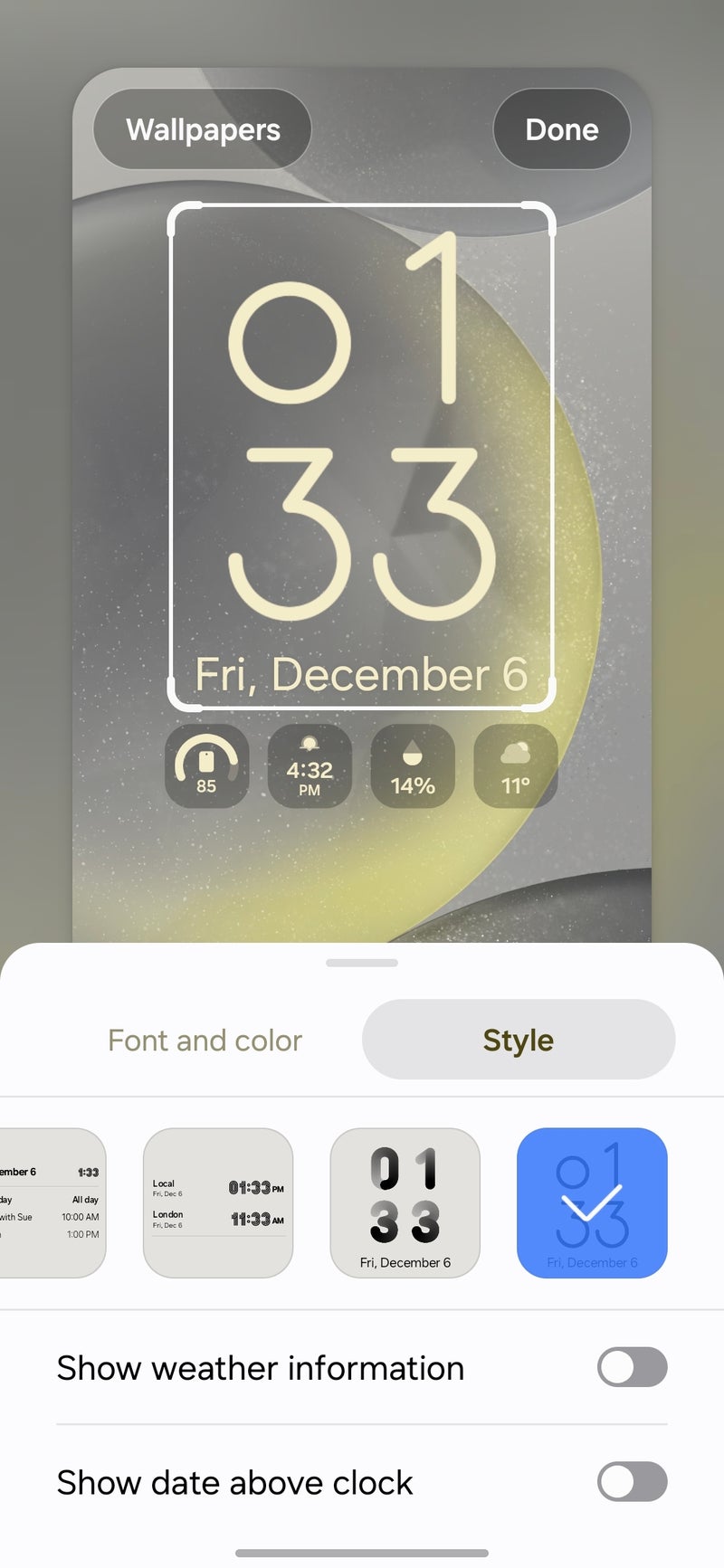
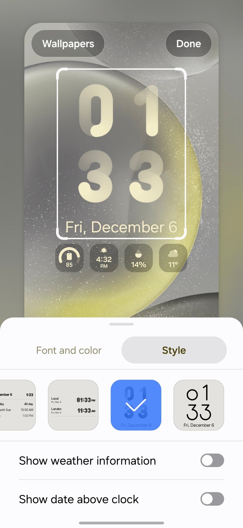
Speaking of the lock screen, it has scored some new clock styles and animations, which further increase the customization options on board. There are also some new available little icon widgets for the lock screen.
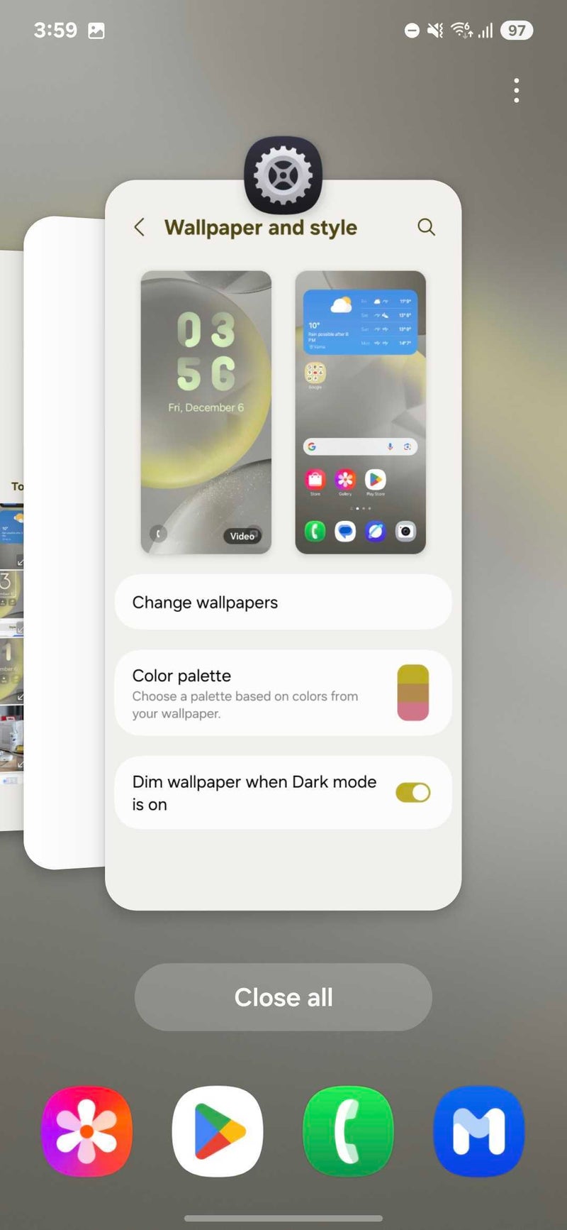
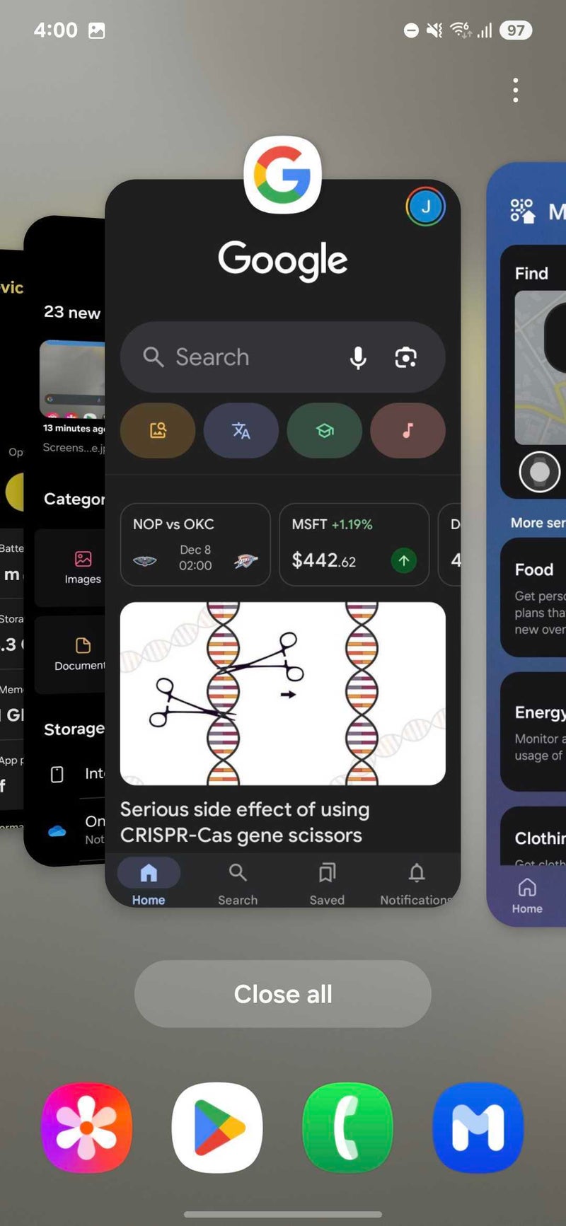
Samsung has also introduced some changes to the app switcher. In essence, the app switcher has evolved from the simplistic one in One UI 6.1 to a more iOS-like app switcher, with multiple app cards stacked on top of one another.
On the home screen, not much has changed
The Samsung Weather app has now got more informative and slightly redesigned, with some of the more obscure climate categories near the middle scoring more engaging graphics that definitely help.
Samsung Weather’s more informative redesign
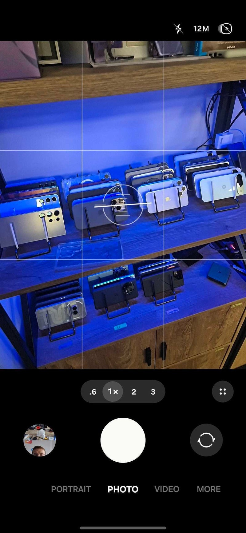
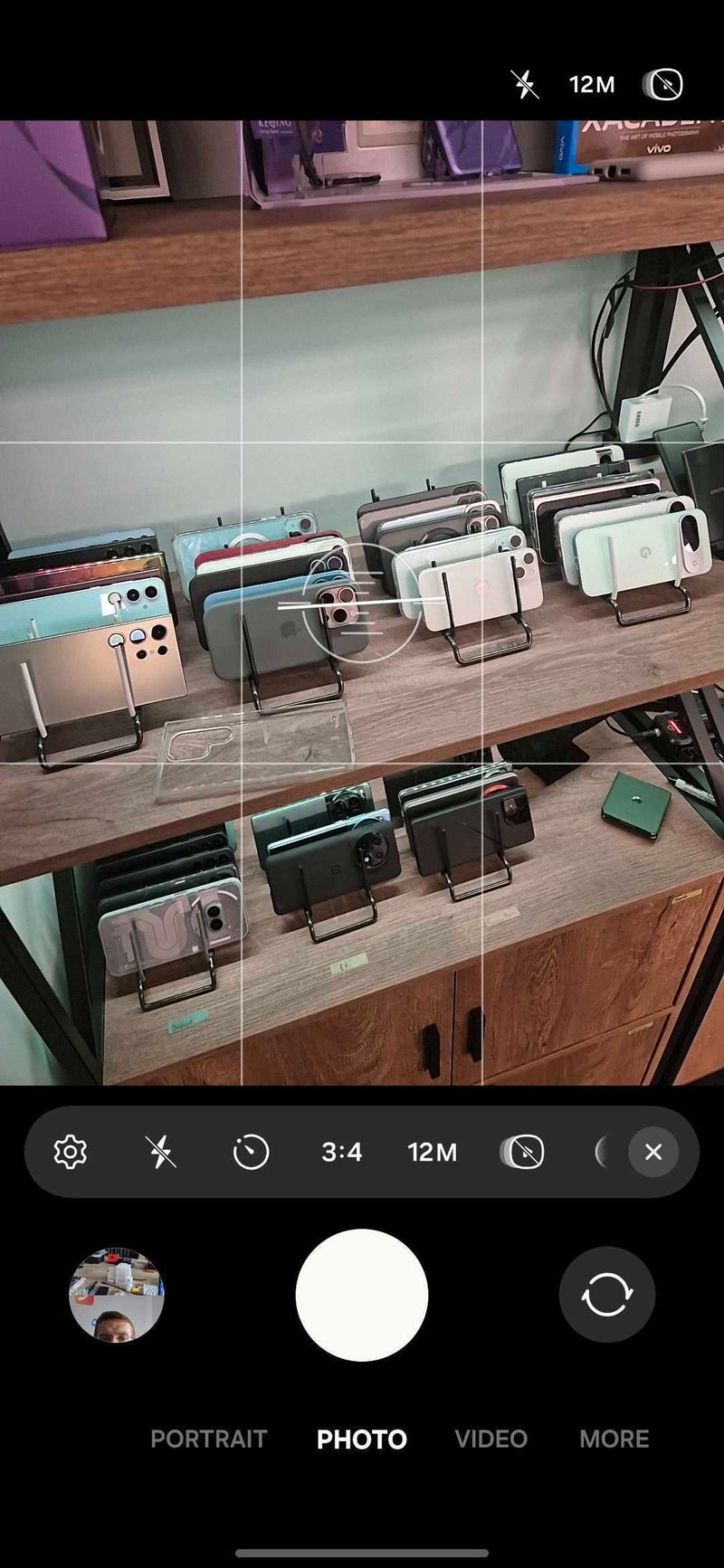
The camera interface has also scored many changes. In fact, it wouldn’t be an overstatement to call it a complete overhaul. The mode selector has been moved to the bottom of the screen, while all quick controls that were previously situated at the top of the screen now dwell in an inconspicuous folder just above the camera selector. Only the Motion Photo, resolution selector, and the flash controls remain at the top. The zoom slider has also been moved down from the actual viewfinder, where it no longer obstruct a portion of the view.
Conclusion
Well, it seems that One UI 7 is shaping up to be a smash-hit success. Objectively, we don’t really see anything we don’t like, with all changes improving the experience. Nice!
Although still in early beta, One UI 7 looks and feels like a treat. On the top of a fairly disappointing Android 15 which didn’t introduce any notable new features, One UI 7 brings around some excellent new features, polishes existing functionalities, and “modernizes” the whole interface.
Animations are super-smooth, addressing some issues with previous One UI releases, where despite the super-powerful hardware on board, some choppiness was still present throughout the interface.
Sure, there are some minor bugs, but we have experienced no major issues. Some visual glitches and irregularities here and there is what you can expect, but then again, have in mind that this is a beta, so don’t install it on your daily driver without a making a backup first.
