Recent rumors claimed the phone will bring a visual change many would appreciate – a wider display with “normal” proportions, or “aspect ratio” as we (the professionals) call it.
Frankly, when I first heard of this possibility, I didn’t make much of it. However, having seen the leaked, official-looking renders of the Xperia VI, I must admit… The cliche might be true. Perhaps a little change really does go a long way!
Sony’s new Xperia 1 VI premium flagship phone made me nostalgic about the way smartphones used to look: Should bezels come back?
See, unlike clothes where different styles go in and out of fashion once every few years, smartphone design seems to have a very linear trajectory. Particularly when it comes to the front of the phone, the goal has always been clear – trim down the bezels until we get to the point where we’re holding what’s essentially a rectangular piece of glass – an uninterrupted, corner to corner display.
But there’s one caveat to this ideal goal, and we’ve been witnessing it for years now. Since the technology isn’t quite there and under-display cameras and other sensors can’t be tucked underneath the screen (yet), phone-makers have to (literally) cut around them, giving us phones with various holes in various places.
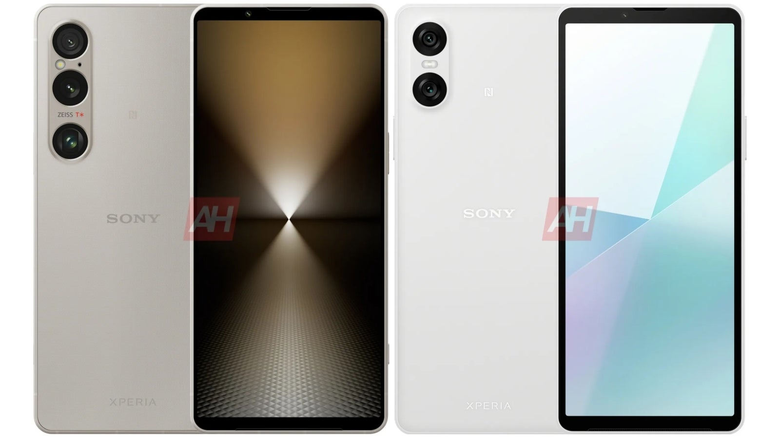
And there comes the new Sony Xperia 1 VI with its old-school top and bottom display borders and zero cutouts, and I must say… This phone managed to make me nostalgic about the times when phones had “love handles”…
How Sony made an Xperia flagship phone that looks modern and unique at the same time

There’s the new, wider aspect ratio, and apart from making the display more practical to use, it seems to make a much bigger visual difference than I expected. The added horizontal area makes the top/bottom bezels look quite a bit less noticeable than on the 2023 Xperia V. Is it an optical illusion? Not quite. It’s quite simple – the larger the display, the smaller the bezels will look.
On top of that, depending on your OCD levels, you’ll appreciate that this is actually the most symmetrical-looking smartphone you can find on the market today. Weird flex… but it’s there if you care about it. I happen to appreciate this little detail.
Thick bezels? Don’t be silly! Millions would buy the Sony Xperia VI if it had an Apple logo on the back
I wouldn’t mind having a phone that looks like the Xperia 1 VI in 2024. Is it nostalgia? Maybe! But I do miss uninterrupted displays on phones, even if they have top and bottom borders, and I’d take them over my iPhone 13 mini’s notch. Still, the thinner – the better.
Ultimately, I think the iterative design upgrades (and especially that new, wider display) finally helped me appreciate Sony’s “stubbornness”, which I now see as consistency that I admire.
You can argue Sony’s new flagship phone doesn’t look as modern as the iPhone 15 Pro, or the Galaxy S24 Ultra, but you must admit Sony makes the most distinct flagship phones out there, and the easiest to recognize too – at least if you know/remember they are still around. Even the Pixel with its horizontal camera bump doesn’t look as unique as a Sony phone.
Again, is this old-school design going to be everybody’s cup of tea? No… But just imagine if Apple had chosen to stick with a similar design on the modern version of the iPhone. No notch on iPhone X – just thinner (than the iPhone 8’s) top and bottom display borders, which get thinner every year, to the point where the iPhone 15 Pro looks similar to the Xperia 1 VI.
Of course, in that case, we would’ve always wondered what it’d be if the iPhone looked like it actually looks today. On the other hand, I really do believe Cupertino would’ve received a good amount of praise for refusing to follow the display cutout trend.
In an alternative universe, people would care about the new Sony Xperia 1 VI


On the other hand, the upcoming mid-range Sony Xperia 10 VI doesn’t look nearly as good as Sony’s flagship. I guess bezel size matters after all.
In reality, Sony isn’t Apple, and the Xperia isn’t the iPhone. And this brings me to the part where I’m obligated to say that no matter what the new Sony phone looks like, it’ll always be a Sony phone.
In other words, nobody seems to give a flying shrimp about Sony phones, and with pricing for the Xperia 1 VI expected to start at €1,500, no flying shrimp shall be given. Not with Sony’s current competition.
But my point stands! It might look “old-school”, but I really like the design of the Xperia 1 VI. The phone is rumored to bring another unique feature – the first variable zoom camera on a phone that can go from 3.5x to 7x optical zoom. Just another sign Sony refuses to play by the book and use digital sensor-cropping for zooming like every other flagship phone in 2024.
We love you, Sony! All six of us.
