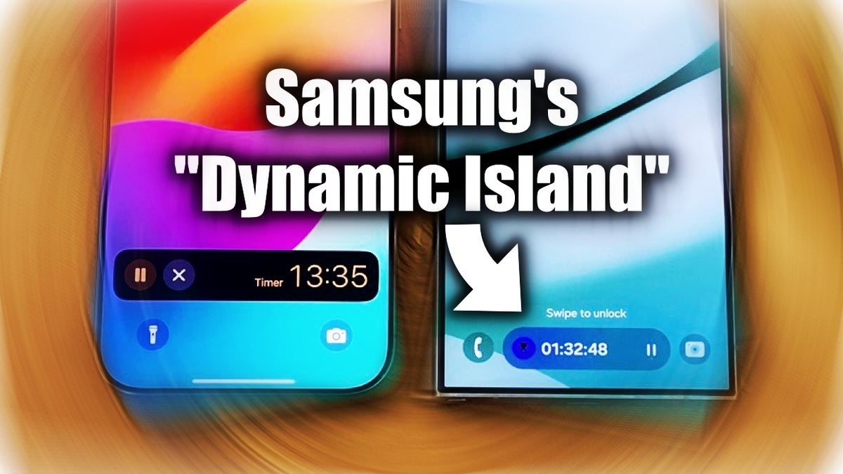
As we’ve established a million times, adopting features found on competing phones isn’t necessarily a bad thing – it can be quite the opposite.
And while last year’s One UI 6.0 update blatantly copied a bunch of iOS 17 design elements, this year’s One UI 7.0 has surprised me positively (so far).
Samsung has put its twist on some existing iPhone/Android features and UI elements, and I really do believe this was the right move! In fact, from what I’ve seen in the One UI 7 beta, I can say I imagine myself using a Galaxy flagship as my primary phone now…
For example:
- Galaxy phones running One UI 7 will group notifications – much like iOS
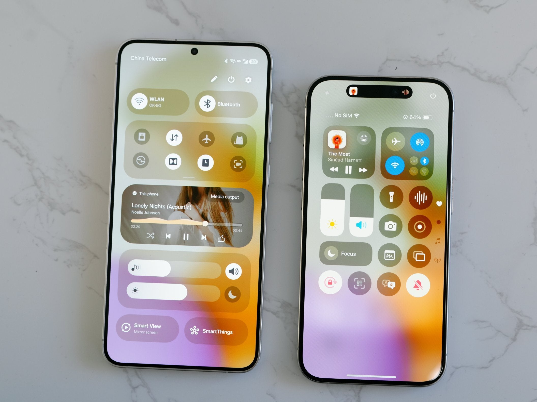
- The notification panel and quick settings panel are now separate – swiping down from the left will bring down the notifications, and swiping down from the right – quick settings
Again – very much like the iPhone, but (unlike Apple) Samsung gives you the choice to revert back to the “old ways”, which is a major win for everyone.Especially due to the fact that (with the new way of doing things) swiping down from anywhere on the screen will now bring down the Notification panel – and not the Quick settings (as it was before). Which is a puzzling decision?!
However, as I said, reverting back to the old swipe controls will also give you back the option to swipe anywhere on the screen to bring down THE RIGHT panel – the Quick settings panel. And I can’t do that on my iPhone.
Samsung’s Camera app will make me take more photos and videos – even if their quality isn’t as good as the competition’s
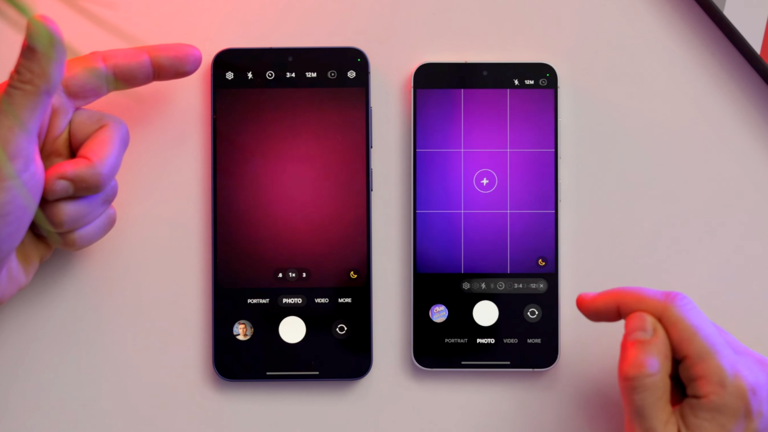
Samsung’s Camera app took after the iPhone’s Camera app design a while ago – particularly with One UI 5 and One UI 6, where even the photo editor became very iPhone-like.
But now, Samsung has set itself apart from the iPhone by placing every single camera button/setting on the bottom half of the Camera app, which is going to make one-handed operation when taking photos/videos SO much easier. Particularly on large phones like the Galaxy Plus and Galaxy Ultra.
The Camera app also lets you assign custom exposure for different photo/video modes that don’t change every time you open the app, which is another feature borrowed from the iPhone, but a great one.
Speaking of photos, I can only wish I had this feature on my iPhone, and this is the ability to create photo AND video collages right from Samsung’s Gallery app – with a layout of my choice.
Samsung has two Dynamic Islands without any gaping holes – not as pretty as the iPhone, but far more practical
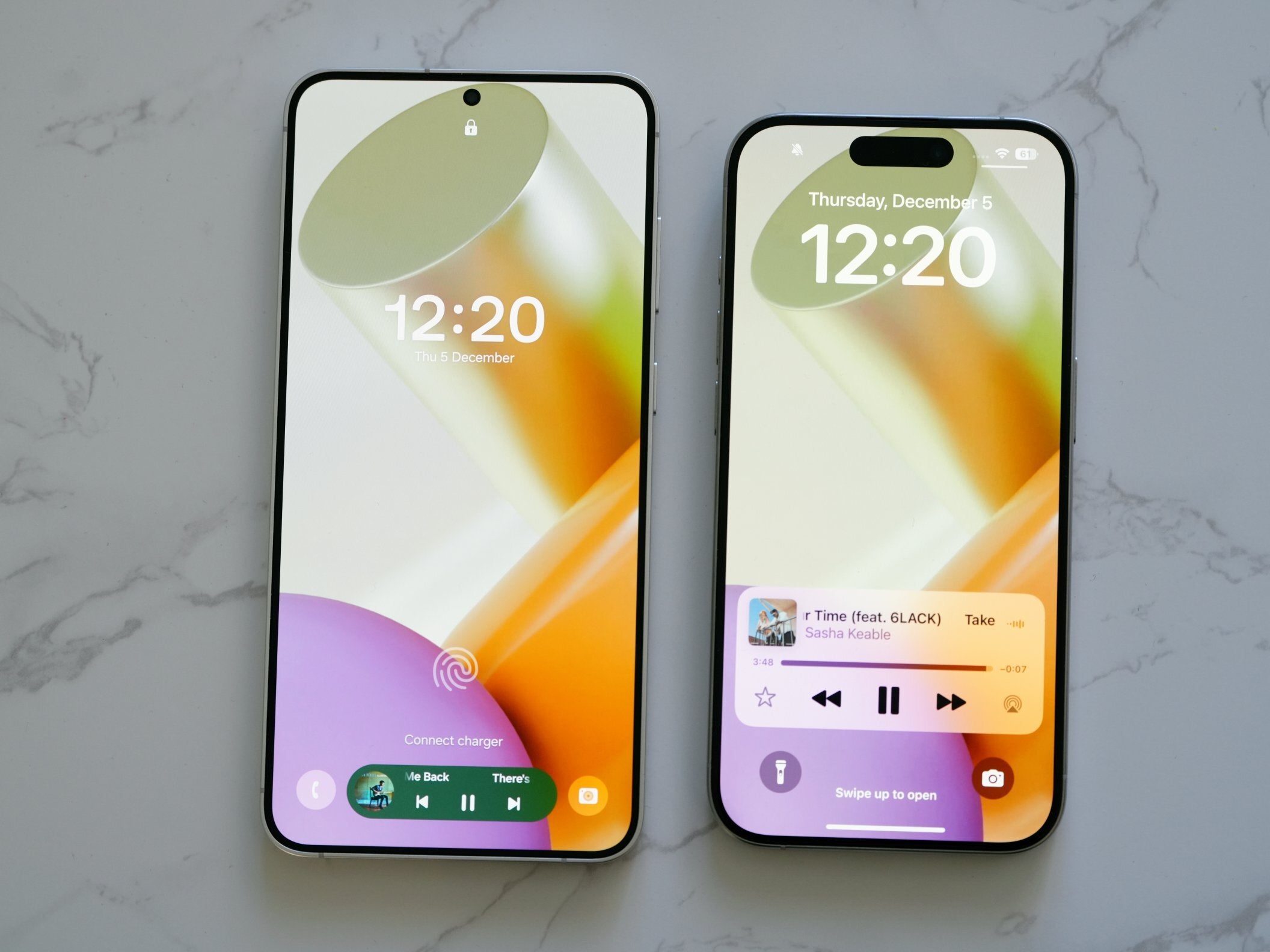

Courtesy of Ice Universe.
- Being available on the Lock screen
- Being placed on the bottom rather than the very top
- Also being available on the top (next to the notification bar) when you want to tap it and switch between quick app controls
I’m not saying Samsung’s way of implementing “Dynamic Island” on the Galaxy is perfect – for example, the icons you click to get the quick actions to pop up are tiny, because they don’t have their designated space to occupy – in other words, a large camera cutout.
However, the Lock screen implementation makes up for it by being arguably more practical, because it’s basically a widget stack you can scroll through and perform identical controls like on the iPhone’s Dynamic Island / stacked widgets.
And-it-is-in-the-right-spot. On-the-bottom. Come-on-now.
Samsung phones now get (almost) everything right – as an iPhone user, I’m super jealous
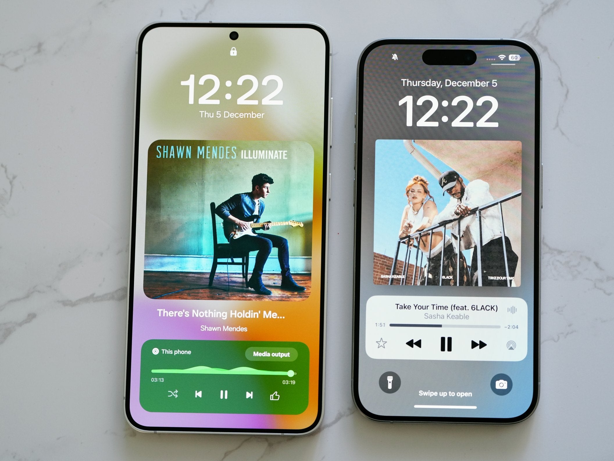

Of course, the changes to One UI 7 aren’t the sole reason I would consider using a Samsung as my primary phone, but that’s actually a great thing.
Samsung phones already get plenty of things right – like the class-leading AI experience, the reliable software support, unique displays (at least on the Ultra model), and the very good (although not the best) camera and battery experience.
As an iPhone user (who’s been using Pixel/Galaxy flagships but not as his primary phones), I’d say Samsung hasn’t made any mind-blowing changes to its software, but the ones it made are enough to make me consider using a Samsung as my main phone. And that’s pretty major stuff for me.
For example, there was never a chance I’d use the Galaxy S24 Ultra as my main phone due to how massive it is – and One UI 6 did very little to make the experience of using this big phone with one hand easier.
Unlike One UI 6, One UI 7 has taken major steps in the right direction with the “Now Bar”, the major Camera app redesign with all controls on the bottom, and even smaller things aimed at making one-hand use better, like the vertical app drawer, and all important Search bars being moved to the very bottom of the screen – like the one in the app drawer, and the one in Settings.
One UI 7 – now, I REALLY want to replace my Pixel Fold with a Galaxy Fold

This is without a doubt something I wish I had on my big iPhone 15 Pro Max, but right now, Apple doesn’t even come close to making large iPhones more usable. I won’t even get into the whole multitasking thing, which is still available on Galaxy, and still a million times better than on iPhone.
My “main” Android phone right now is the Google Pixel 9 Pro Fold, and if I had to choose an Android phone to use alongside my iPhone 13 mini, it’d definitely be a foldable due to how the two complement each other.
And while I was already contemplating switching to a Galaxy foldable before, One UI 7’s new practical updates are pushing me closer and closer to replacing my Pixel Fold with a Galaxy Fold.
Can the full version of One UI 7.0, or the Galaxy S25 series make my decision even easier? I believe so… What about you?
