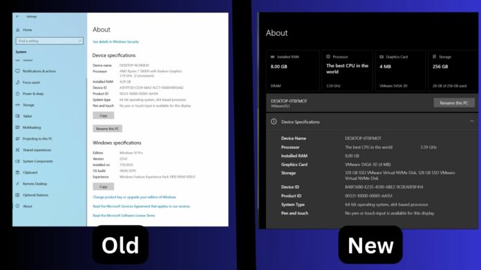
Windows 10 is supposed to be on the back burner, but it keeps getting new stuff, especially from Windows 11. We’ve seen Microsoft add features like Copilot to Windows 10, which was initially exclusive to Windows 11. Then, Microsoft added the “Microsoft account” manager to Windows 10. Now, it’s getting Windows 11’s About page UI.
Microsoft recently shipped a new update for testers in the Release Preview Cahnnel with an interesting change. The About section of the Settings app has a different UI, which makes it easy to check all the available components and system data. However, the problem with the new UI is that it doesn’t fit Windows 10’s UI guidelines.
Windows Latest compared the existing About page UI with the new one, and the change was pretty obvious. Unlike the old design, which has sections that describe Device and System specs, the new design lists all the hardware specs at the top. This includes the installed RAM, Processor, Graphics Card and Storage.

This grid design is easy on the eyes and you can get a good idea of the basic hardware specs of the PC, including the GPU. The next design change is adding collapsible sections.
In Windows 10, the About page lists everything in one go, which can be confusing to understand if you’re new to Windows.
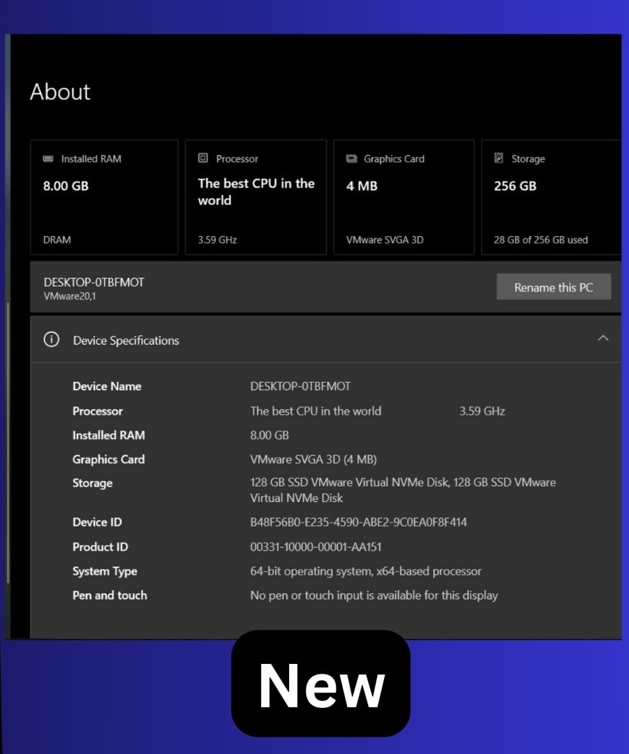

Microsoft took a hint from Windows 11’s About page and now includes a collapsible section for Device Specifications and System Specifications.
It results in a neat and organized look. Even the Rename this PC option is now at the top, like Windows 11.
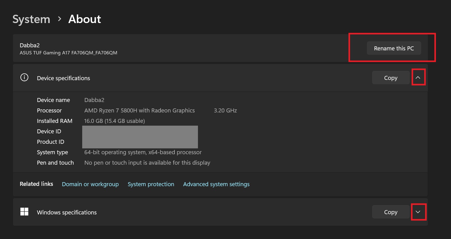

The Device Specifications section also bundles a few FAQs. These are nothing special and super generic, but might be helpful for a new user.
One thing that surprises us is the mixture of fluent UI and metro UI, which doesn’t look great at all. It looks flat and weird. We love its structure, but the color schemes and other elements don’t resemble a modern OS.
Still, it is surprising to see a design change in Windows 10 since it’s less than a year away from retirement. Microsoft also plans to bring the Windows 11 Account Manager in Start to Windows 10.
Account Manager in Start


Windows 10 will get the Account Manager in Start with the October or November optional update.
The feature arrived late because Microsoft made several design changes. The Sign-out button is now visible at the top, and you can switch to another user account using the context menu.
Several other Start menu tweaks arrived with the October 2024 security update. The profile icon appears at a different position, and you’ll get a new background color for the left pane.
Special thanks to @Phantomofearth on X!
