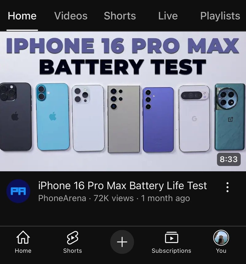
The bottom bar before (left) and after the update (right). | Image credit – PhoneArena
As you can see from the screenshots, YouTube has made some tweaks to its bottom bar icons. The “plus” sign for creating content now sits in a gray circle without an outline. The subscriptions icon is more simplified, with a shallower design and rounder edges. The Home icon has also been refreshed, offering a clearer, more noticeable design. Meanwhile, the Shorts icon now sports thicker lines. The You tab remains unchanged.The updated bottom bar is now rolling out with version 19.45 of YouTube for Android, and it’s also available on iOS and the web. While this change might fly under the radar for many since it’s not a major update, I think the new look makes the bottom bar feel a bit more polished compared to its previous design.
In other YouTube news, the app is testing some bigger changes that might not be everyone’s cup of tea, myself included. For instance, it’s working on a TikTok-like swipe-up gesture to skip to the next video. The app is also experimenting with AI-generated music remixes, which I think could be hit or miss. However, on the brighter side, YouTube decided to roll back the controversial PiP mini-player update, bringing back the old one that users preferred.

