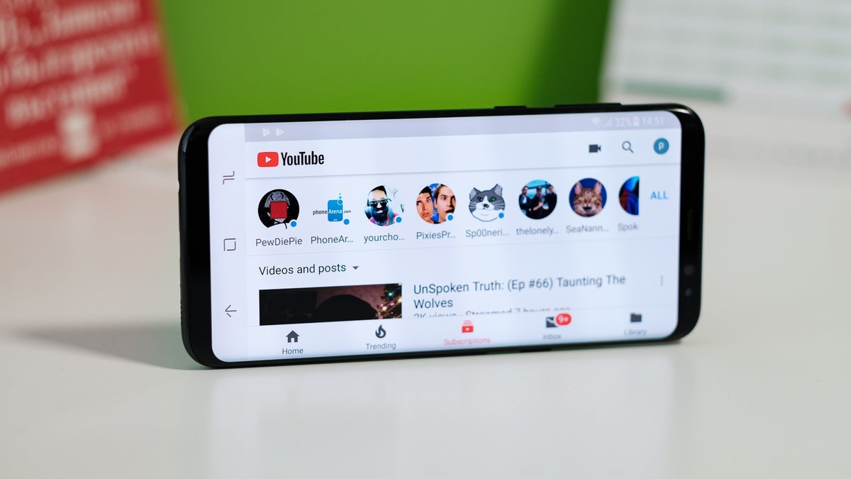
YouTube often makes changes to its design – some that make sense and others that are a bit confusing. Recently, YouTube has been testing a new look for its Android app. This includes a bottom bar similar to the one on iPhones, with updated icons for Home and Subscriptions, and a see-through bar that shows what’s behind it. The app also added a new bell icon for the YouTube Music app and redesigned the artist pages.

Image Credit – Reddit
But now, YouTube seems to be trying out a progress bar that starts red and fades into pink as you get closer to the end of the video. This doesn’t change how YouTube works, but it’s a noticeable difference that people are starting to see.
This new progress bar has been spotted by both Premium and non-Premium users, on mobile devices and the web. YouTube hasn’t officially announced this change, and users aren’t running any extensions or add-ons that could cause it. Some people noticed the change a couple of months ago, while others have just seen it recently.
As for why this change is happening, it’s not entirely clear. It could be just a simple design update meant to look nicer. The transition from red to pink seems smooth, and the pink might give a calming sense of completion when the video ends.
It’s important to note that while some users have seen this new design, it’s not widespread yet. We’re not sure if this red-to-pink progress bar will become a permanent feature for everyone or if it’s just another experiment YouTube is trying out.
In my opinion, the red-to-pink progress bar is a subtle but nice visual change that adds a bit of freshness to the YouTube experience. However, since it doesn’t really improve functionality, I wonder if it’s necessary or just another cosmetic tweak that might not appeal to everyone.
